3 Pipeline Quality Metrics in Salesforce That Point Towards Unreliable Revenue Forecasts
And How to Boost Your Forecast accuracy with Better Pipeline Scrutiny
Last updated June 3, 2026


Download the 12 Must-Have Charts for Your Salesforce Dashboard eBook today!
Pipeline quality metrics in Salesforce should give you confidence that your business will hit its sales revenue targets. In an ideal world, every opportunity in your revenue forecast scheduled to close this month would do so. Close dates would always be accurate. Customers would sign when anticipated. Revenue forecasts would consistently hit the mark.
Yet skepticism about pipeline quality and forecast accuracy is well-founded. Deals you expect to close can slip into next month or next quarter – and they can slip for many reasons, often through no fault of the salesperson. It’s just the nature of sales.
However, pipeline quality metrics in Salesforce help determine which opportunities you can rely on and which ones deserve closer scrutiny. When used effectively, they help sales leaders and teams focus on what matters most, which results in better pipeline quality and forecast accuracy for the month or quarter ahead.
Your Guide to Pipeline Quality Metrics in Salesforce
Three Pipeline Quality Metrics
The goal of pipeline quality metrics in Salesforce is simple: identify deals at high risk of slipping so you have time to address them. The 3 most effective pipeline quality metrics are:
- Number of Close Date Month Extensions (Push Counter)
- Number of Days Since the Last Stage Change
- Number of Days the Opportunity Has Been Open
Let’s consider each in more detail:
Pipeline Quality Metric 1: Number of Close Date Month Extensions
This Salesforce metric is often called the push counter because it measures how many times an opportunity’s Close Date has slipped by one month. It is a critical pipeline quality indicator because once a deal slips, there’s a higher likelihood it will slip again. That risk increases significantly if the opportunity has already been pushed 2, 3, or even 4 times.
NOTE: If the Close Date changes within the same month, it doesn’t matter. Nor do changes that bring the Close Date forward. This metric only tracks how often the Close Date has moved from one month to a later month.
Pipeline Quality Metric 2: Days Since Last Stage Change
Sales cycles are rarely linear because Opportunity stages don’t move forward at perfectly regular intervals. However, when a long period passes without any stage change — especially when compared with your typical sales cycle — it can be a clear sign that a deal has stalled. In other words, a high ‘days since last stage change’ value is often an early signal that a deal may be dormant and that the forecast deserves closer scrutiny.
Pipeline Quality Metric 3: Number of Days Open
On its own, this metric provides valuable insight. However, its primary value is in contextualizing the other pipeline quality metrics. In combination with Close Date Month Extensions and Days Since Last Stage Change, the Number of Days Open metric helps pinpoint deals that deserve closer scrutiny and more realistic forecasting.
How Do You Apply Pipeline Quality Metrics in Salesforce?
Pipeline quality metrics in Salesforce allow you to assess whether you have sufficient pipeline coverage to meet your sales quota, because they identify dormant deals that are bloating and waterlogging your sales funnel.
For example, imagine your average sales cycle is 3 months. You have a deal due to close this month, and it’s making a vital contribution to your revenue forecast. But the Close Date has already slipped by one month 4 times. And while it’s now in the final Negotiation Stage, it’s been there for over 2 months – plus, the Opportunity has been open for 180 days.
How confident are you that it will close this month?

If you’re questioning whether it’s a reliable deal, you’re probably right. It’s potentially a deal that should not be in your pipeline for this month, because it will affect your forecast accuracy.
Opportunities with higher pipeline quality metrics deserve the most scrutiny. And while no single metric tells the whole story, combined, they highlight the deals most likely to slip. When reviewing progress against targets, these are the opportunities that require deeper questioning – and you should encourage your salespeople to use them to self-manage and strengthen their pipeline.
When applied consistently, pipeline quality metrics in Salesforce provide a simple yet powerful way to improve pipeline quality and forecast accuracy, thereby increasing confidence in the opportunities expected to close this month or quarter.
What Do Pipeline Quality Metrics in Salesforce Look Like on Sales Dashboards?
The following shows an example of these pipeline quality metrics in Salesforce on a single sales dashboard.
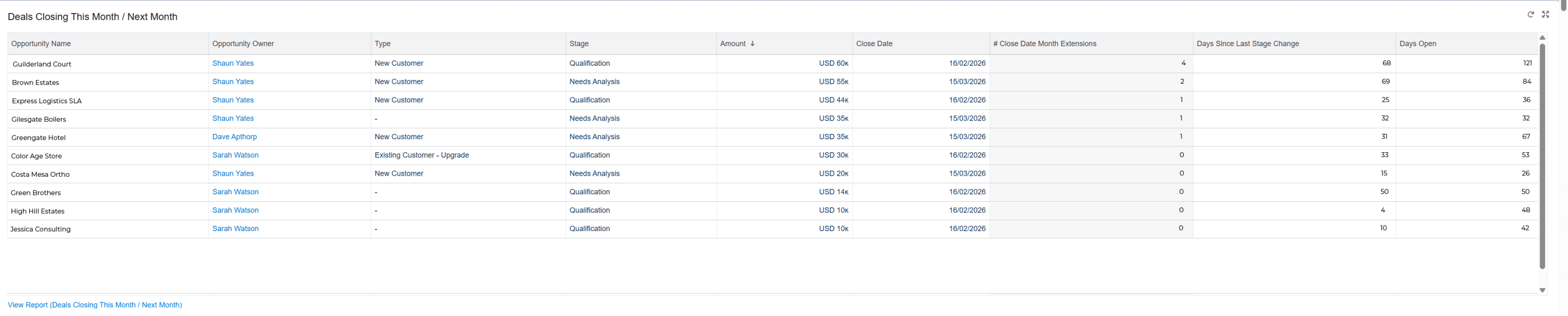
The sales dashboard table contains some deals that are due to close this month. However, by scrutinizing the pipeline quality metrics, it’s easy to identify likely slip opportunities and gauge the reliability of your revenue forecast for the period.
Is Your Salesforce Working as Hard as You Are?
Book a free 45-minute review. Bring your biggest challenge — we'll give you straight-talking, actionable advice, no strings attached.
Free Salesforce Review | 45 Minute Web Meeting | You Set the Agenda
How Do You Report on Pipeline Quality Metrics in Salesforce?
Here’s the underlying report that shows the 3 pipeline quality metrics for all opportunities due to close this month, grouped by Opportunity Stage.
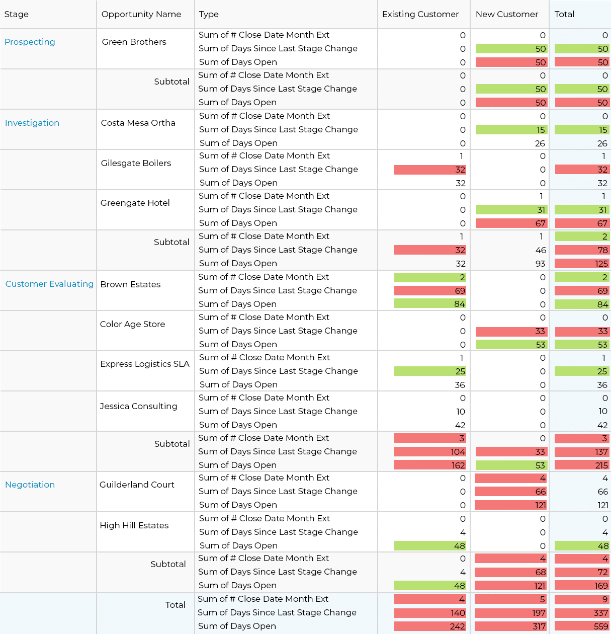
Conditional highlighting draws the eye to the deals you want to question. For example, 3+ Close Date Month Extensions are red, and 2 shifts in the Close Date are in amber. One or zero values for this pipeline quality metric are not highlighted.
Top Tip!
Display deal quality metrics for new customers and with existing customers separately, because, as a rule of thumb, deals with new customers tend to take longer. They are subject to more uncertainty than those with existing customers.
Let’s take some examples from our report to see how the pipeline quality metrics in Salesforce work. Remember, each of these deals is included in this month's revenue forecast.
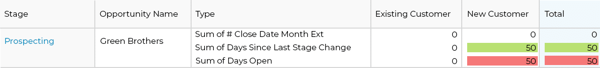
Green Brothers
This opportunity is in the Prospecting Stage. It’s also with a new customer. The pipeline quality metrics tell us:
- The Number of Days Open and the Number of Days since the Last Stage Change are the same.
- The opportunity hasn’t slipped.
However, the Stage hasn’t changed, indicating the deal has not progressed since the salesperson first opened it. If we assume the opportunity is in the correct Stage and there’s no sandbagging, you should be cautious about whether it will close this month.
Greengate Hotel
According to the pipeline quality metrics in Salesforce:
- The deal has slipped once already.
- It's been open for over 2 months.
Also, we're only in the Investigation Stage, even though it's due to close this month. And the opportunity is for a new customer, so it's another deal to question.

Brown Estates
This deal is for an existing customer. On the face of it, that gives us more confidence that the deal will close successfully. However, the pipeline quality metrics indicate you should be skeptical about whether it will close this month, because:
- The Close Date has twice moved from one month to another.
- The Opportunity has been in Customer Evaluating for over 2 months.
In this situation, it pays to ask some key questions, which may provide some reassurance over whether the deal will successfully close:
- What do we know about Brown Estates?
- Are they a high-quality customer who has purchased from us many times before?
- How long do they usually take to decide?
- Do we have a relationship with the customer that allows us to have a straight dialogue about whether the deal will close successfully this month?

Guilderland Court
Take a look at the pipeline quality metrics on this one:
- The opportunity has moved from one month to another 4 times.
- It’s been in the Negotiation stage for over 2 months.
- The deal has been open for 4 months.
Plus, it’s for a new customer –definitely another one to question.

High Hill Estates
Does this deal look better? Quite possibly.
- The opportunity hasn’t slipped from month to month.
- The salesperson updated it to Negotiation 4 days ago.
- The deal is 48 days old.
While the Days Open pipeline quality metric alone might make you doubt the close date this month, knowing it’s for an existing customer means a shorter sales cycle is a reasonable possibility.
Again, asking some key questions about the opportunity will help you determine whether the deal is likely to close on time:
- Are there planned actions that will expedite the negotiation?
- As the sales manager, do I know our trading history with High Hill Estates?
- Based on previous experience and knowledge of the deal's context, are you confident in the closing date?

How to Get These Pipeline Quality Metrics in Salesforce
The three pipeline quality metrics – # Close Date Month Changes, # Days Open, # Days Since Last Stage Change – are all included in GSP Target Tracker. The metrics play an important role in assessing pipeline quality and forecast accuracy versus sales targets.
Additionally, the Sales Manager Dashboard in GSP Target Tracker uses these reports to help leaders and executives identify opportunities that may be overstating pipeline coverage and pose a risk to quota attainment.
Get Expert Eyes on Your Salesforce — Free.
Book a free 45-minute consultation and walk away with clear, practical recommendations. No sales pitch. Just honest advice.
Free 45-Minute Review · Your Topic, Your Agenda · No Obligation