Master Your Pipeline Coverage with the Sales Manager Dashboard
The pipeline coverage and sales performance visibility managers need to stay ahead
Last updated June 3, 2026


Download the 12 Must-Have Charts for Your Salesforce Dashboard eBook today!
Do you have full visibility of your pipeline coverage? Because hitting your sales targets without a clear view of your funnel can be frustrating – not to mention, the biggest reason forecasts fall short. The hard truth is, confidence in hitting your sales targets becomes a guessing game, unless you have a strong understanding of pipeline coverage versus those sales targets.
So, what if you could see the deals that are likely to close, and those that need immediate attention?
What if you knew how to increase your pipeline coverage? And what if you had complete confidence in your sales targets?
Pro Tip!
Pipeline coverage measures whether your sales funnel has enough deals of sufficient quality to meet your sales targets. Using pipeline coverage reports and metrics, you can compare sales targets with weighted and unweighted funnel values, gaining actionable insights to hit sales quotas.
This is where the Sales Manager Dashboard, which is part of the GSP Target Tracker app, comes into play. Sales leaders know strong, accurate pipeline coverage is the backbone of hitting sales targets. The Sales Manager Dashboard gives you unparalleled visibility into your sales funnel, ensuring you can confidently answer three critical questions:
- Do I have enough pipeline coverage to achieve my revenue targets?
- Is the pipeline quality strong enough to hit the figure I need?
- Which high-impact deals should I prioritize right now to meet my goals?
In this article, we take a deep dive into the Sales Manager Dashboard to explore how it supports pipeline coverage, what the reports and charts tell you about how to hit your sales targets, and share best practices from other businesses.
Master Pipeline Coverage With The Sales Manager Dashboard
How Strong is Your Pipeline Coverage Today?
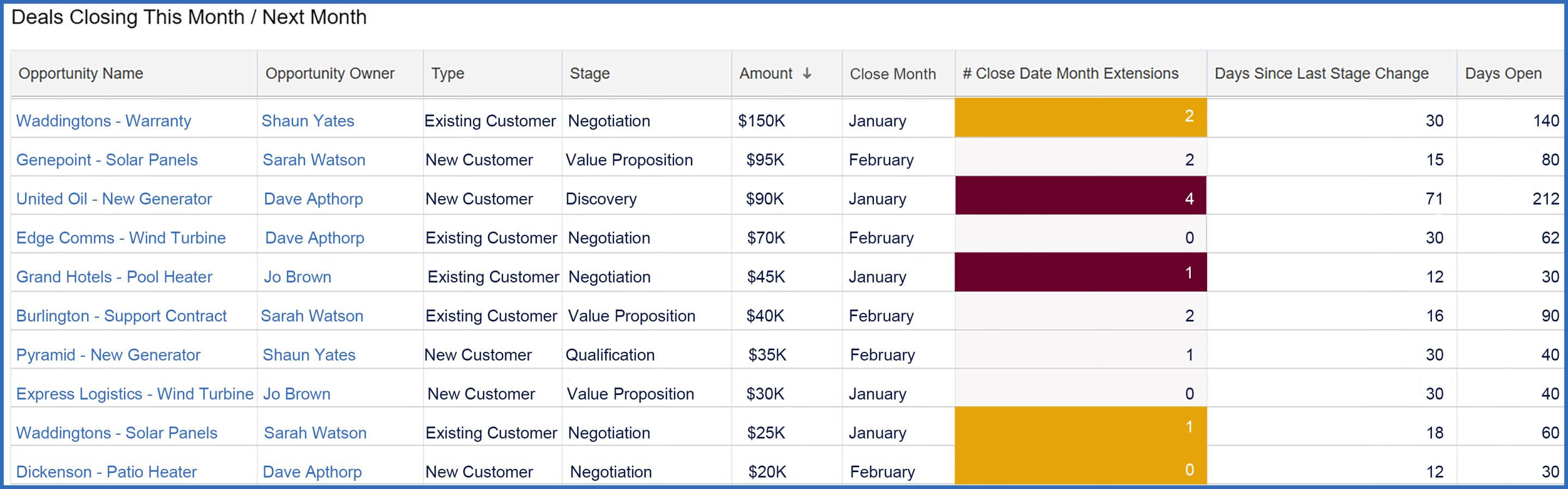
The table below is your starting point on the Sales Manager Dashboard because it shows critical metrics for deals closing this month and next month. If you are confident that the deals scheduled to close this month and next are legitimate, your pipeline coverage metrics provide a reliable, robust picture. Also, because the table clarifies which opportunities merit attention, your sales managers can prioritize effectively and weed out opportunities that are likely to slip, so they can take earlier action.
What It Shows
This table displays open opportunities set to close this month and next, ranked by deal size. For each deal, you'll find essential details:
- Opportunity Name
- Owner, Type (e.g., New or Existing Customer)
- Stage
- Amount
- Close Date
Additionally, the table highlights 3 critical pipeline quality metrics:
- Close Date Month Extensions: tracks how often the Close Date has shifted to a new month – 3+ shifts are highlighted in red.
- Days Since Last Stage Change: measures time elapsed since the sales team last updated the opportunity's stage.
- Days Open: calculates the time the opportunity has been in the pipeline.
Why it Matters
If you want accurate pipeline coverage metrics, the starting point is to remove dead wood from your funnel.
Let's consider an example. Assume it's mid-January, and the third opportunity on the list is "United Oil Refinery – New Generator".
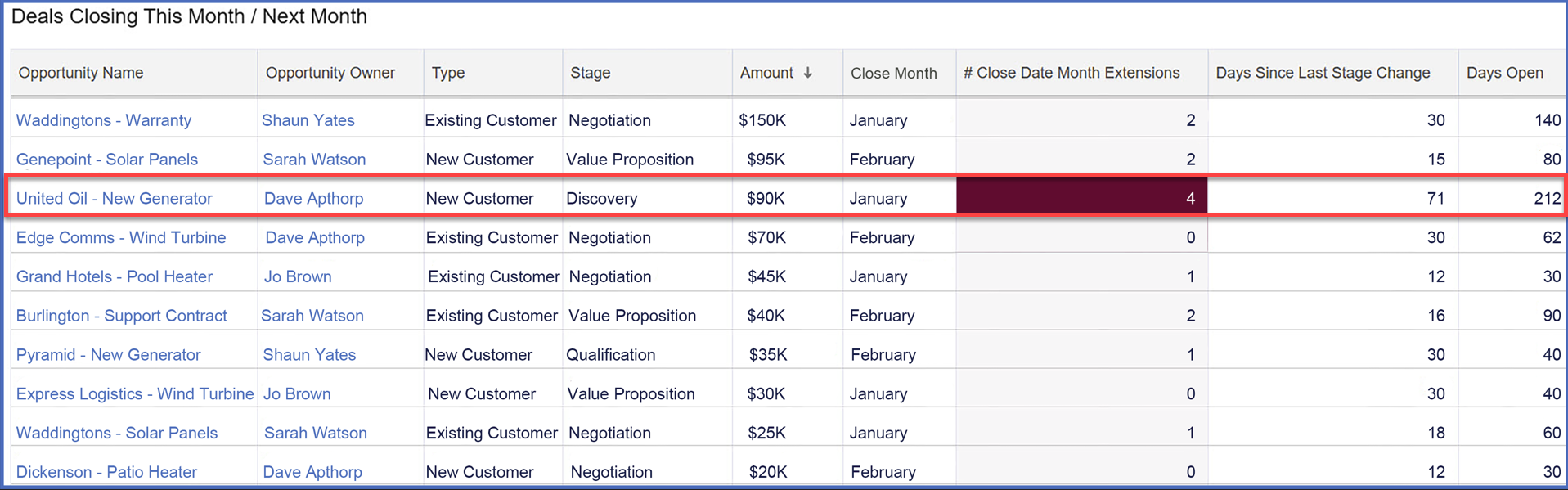
Here's what stands out:
- Close Date: end of January – just 2 weeks away.
- Stage: still in the Discovery phase.
- Extensions: the Close Date has slipped 4 times.
- Stage Change: over 2 months since the last Stage update.
- Days Open: the deal has been in the pipeline for 212 days.
- Type: New Customer.
These details immediately raise red flags. A deal in this condition risks slipping out of the forecast, undermining your pipeline coverage and forecast reliability. While there could be valid reasons why the opportunity owner, Dave Apthorp, believes it will close on time, the metrics reveal this deal requires further scrutiny.
Pro Tip!
Right-click on the Opportunity Name to see the deal in a separate tab. That way, you can investigate the opportunity while keeping the Sales Manager Dashboard open.
3 Best Practice Tips
- Sense-check opportunities: review the deals in this table before diving into the pipeline coverage metrics further down the dashboard. Are any close dates overly optimistic? Should some opportunities be deferred or removed altogether?
- Watch for high-risk deals: pay special attention to opportunities with 3+ Close Date Extensions (highlighted in red). Deals that repeatedly slip are less likely to close successfully.
- Engage your team: encourage your sales team to review their deals before your cadence calls. They should ensure the dashboard reflects their most realistic projections. Let them own their data—your role is to facilitate discussions based on their input, not do the groundwork for them.
Pro Tip!
Salespeople can use the opportunity owner filter at the top of the dashboard to condense the charts and reports to show only their deals and targets.
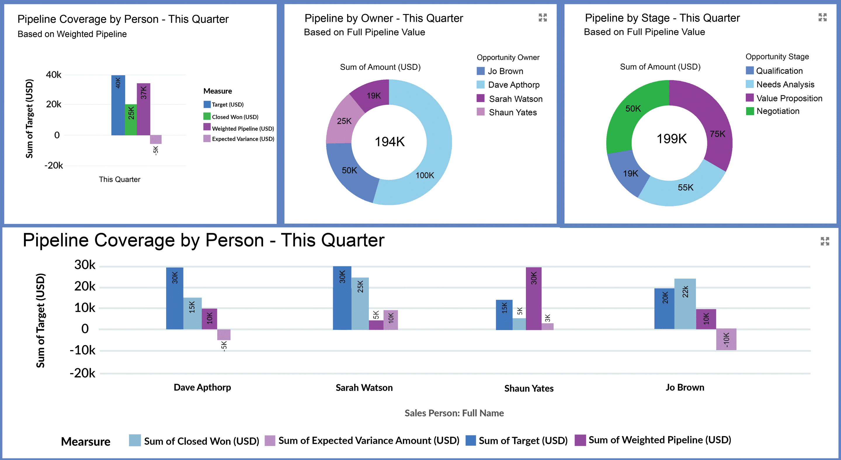
Is Your Pipeline Coverage Suffcient This Month?
The second row of the Sales Manager Dashboard focuses on pipeline coverage for this month. It includes three key charts:
- Pipeline Coverage Summary for This Month.
- Pipeline by Owner.
- Pipeline by Stage.
These charts and the underlying reports provide critical insights that help you assess the health of your pipeline coverage, validate its quality, and track sales versus target.
Let's take a quick look at each chart.
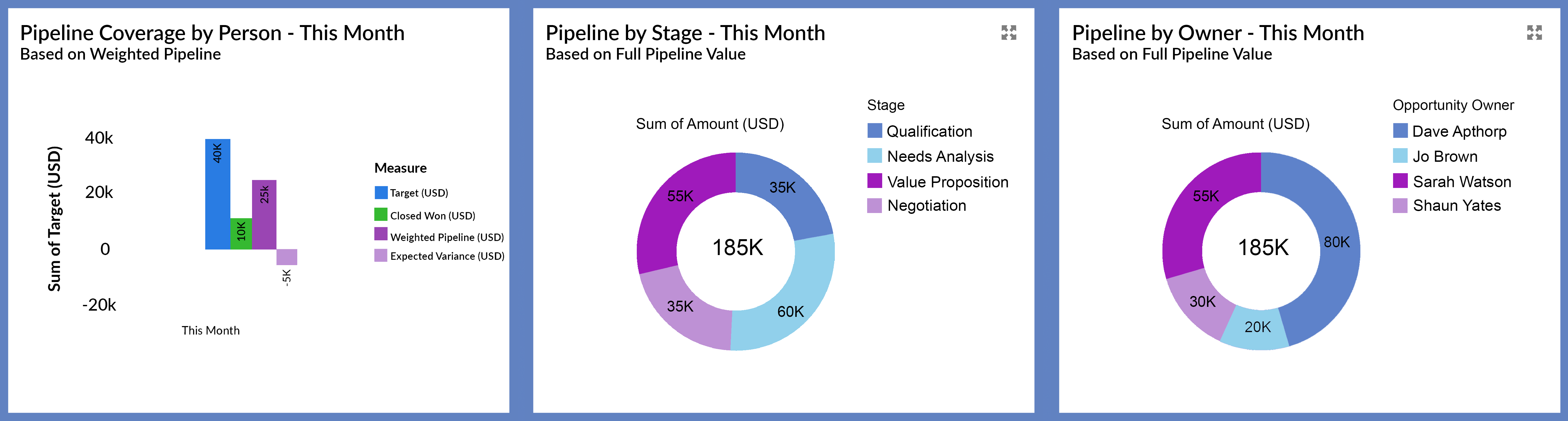
1. Pipeline Coverage Summary for This Month
This chart summarizes the pipeline coverage across all salespeople in the team.
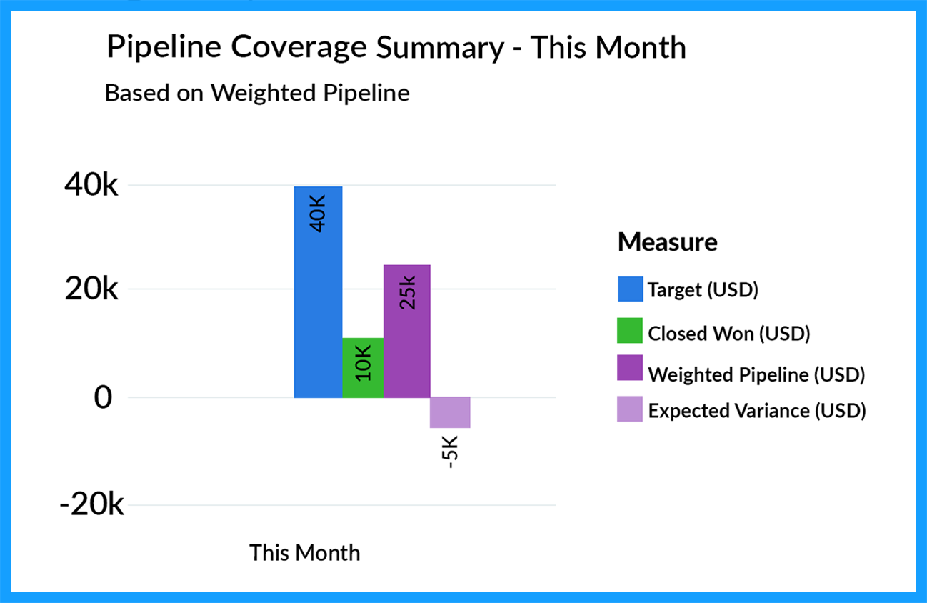
What it Shows
This chart compares the monthly revenue target to two numbers:
- Closed Won Deals: revenue from deals already secured this month.
- Weighted Pipeline: the expected value of opportunities due to close, which is calculated by multiplying deal amounts by their probabilities.
The final column highlights the variance between the target and the sum of these two numbers, instantly revealing whether your team has sufficient pipeline coverage to meet its sales targets (in this example, we don’t have enough).
Why This Matters
The Pipeline Coverage Summary chart provides a real-time snapshot of whether your current funnel coverage is sufficient to hit the sales targets. For example, a negative variance indicates a shortfall, meaning you must act to close the gap.
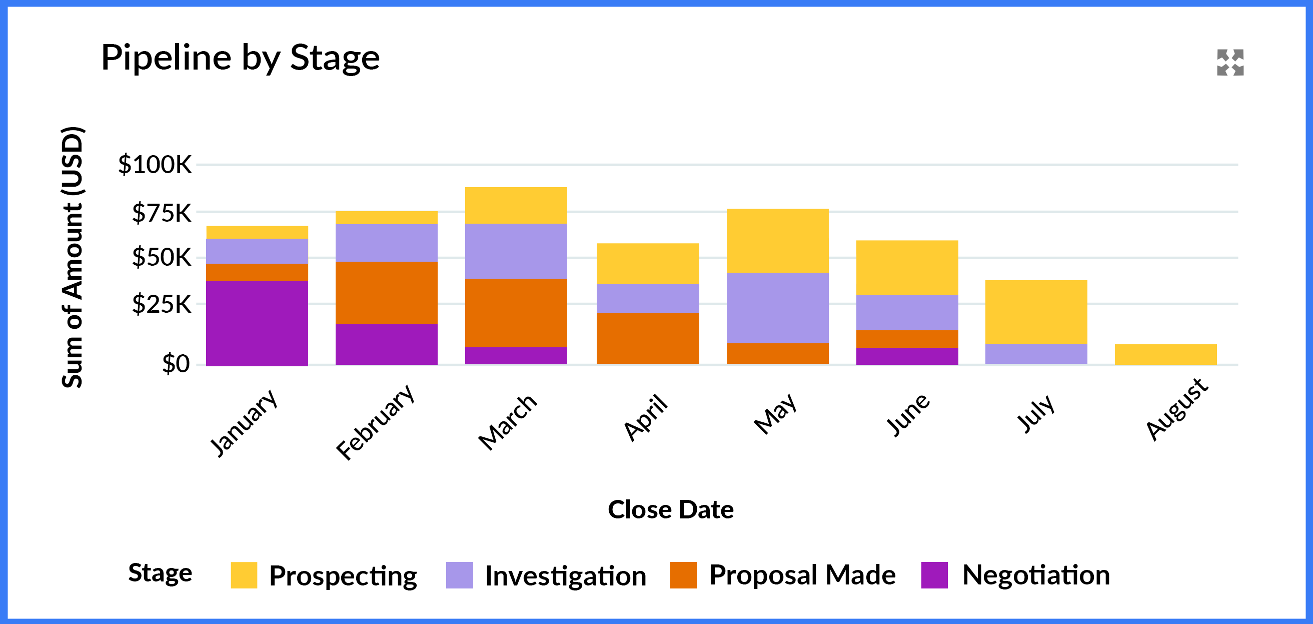
2. Pipeline by Stage
This chart displays the total pipeline scheduled to close this month, segmented by opportunity stage.

What it Shows
The Pipeline by Stage chart breaks down the total pipeline for the month by opportunity stage.
Why This Matters
This chart helps you gauge the reliability of your pipeline coverage. A funnel heavily weighted with early-stage deals likely indicates an over-optimistic forecast. Given that the chart shows pipeline deals due to close this month, you expect most deals to be in the later stages of your sales process.
3. Pipeline by Owner
This chart displays the total pipeline scheduled to close this month, segmented by opportunity owner.
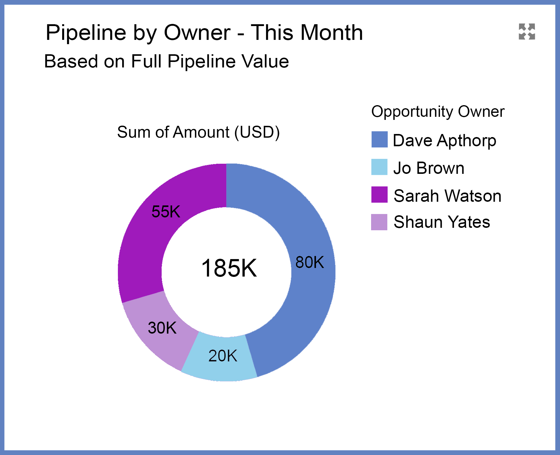
What it Shows
The Pipeline by Stage chart breaks down the total pipeline for the month by opportunity owner.
Why This Matters
This chart highlights whether a small number of reps, or even a single salesperson, is responsible for a disproportionate share of the pipeline set to close this month. If so, you have a lot of eggs in one basket, and that means your forecast is potentially at risk. Validating the deals and supporting this salesperson will be a key management focus.
3 Best Practice Tips
- Positive Pipeline Coverage: focus on closing the deals already in your pipeline. That includes creating a detailed Close Plan specifying the actions you and the customer must take to bring the deal to fruition.
- Negative Pipeline Coverage: you need additional pipeline deals to meet your sales target. Consider leveraging existing customers or identifying minor upgrades and incremental opportunities. In addition, review the pipeline for next month - are there deals you can bring forward and close earlier?
- Assess the Pipeline by Stage and Owner: ensure the distribution of opportunities across stages is balanced appropriately. A disproportionate number of deals in the early stages threatens your pipeline coverage. And review the pipeline by Opportunity Owner to pinpoint which high impact deals you should prioritize.
What Does Your Pipeline Coverage Tell You About Performance Against Individual Sales Targets?
The third row of the Sales Manager Dashboard provides a detailed breakdown of pipeline coverage for each salesperson this month.
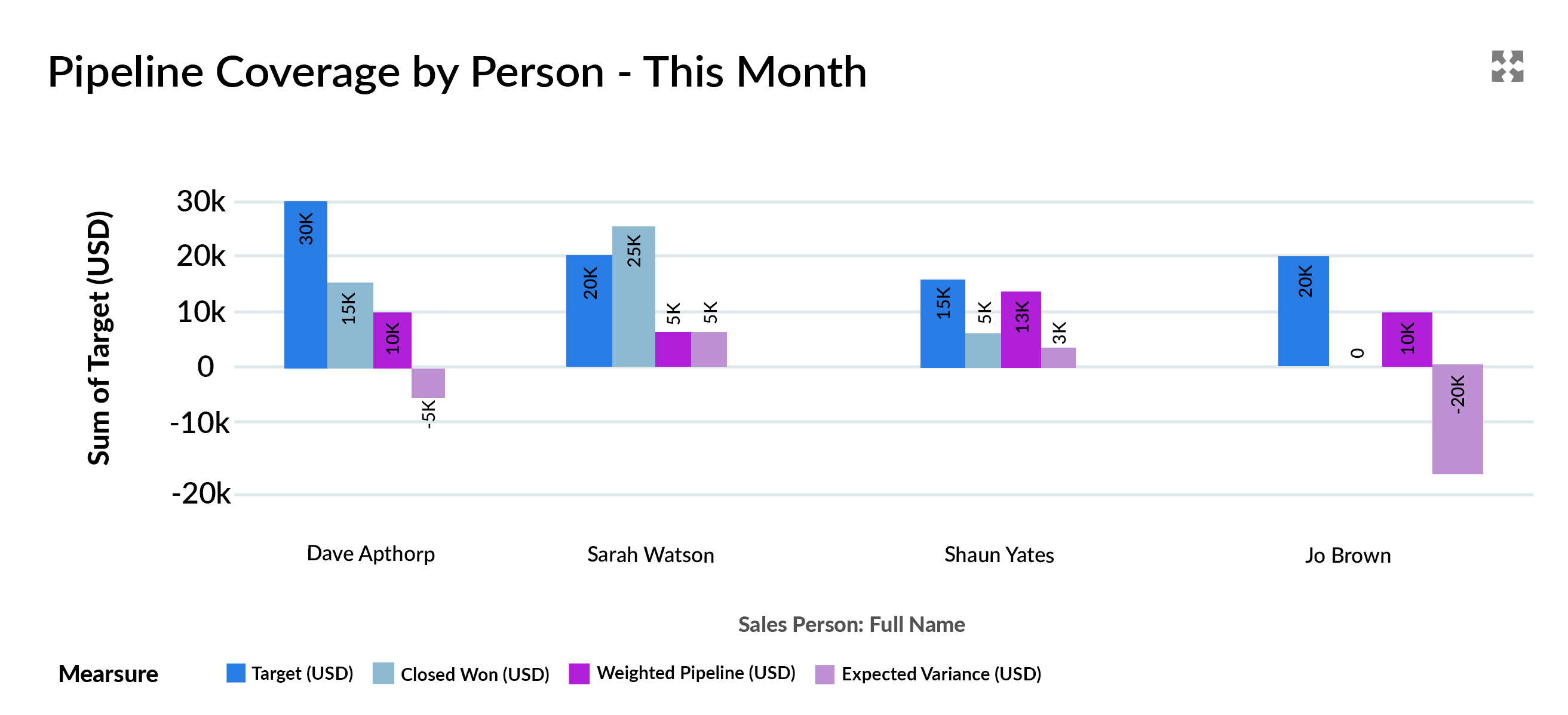
What it Shows
This chart displays these critical metrics for every team member:
- Revenue Target: the sales targets for the individual for the month.
- Deals Won: the value of closed-won opportunities.
- Weighted Pipeline: calculated by multiplying the opportunity amount by its probability.
- Expected Variance: the gap between the sales target and Expected Revenue (the combined total of Deals Won and the Weighted Pipeline).
In the above example:
- Dave has the highest target but a slight negative variance, indicating he's close but marginally short of his sales target.
- Sarah has already exceeded her sales target, putting her in excellent shape.
- Shaun has a positive variance, but he needs to close those pipeline deals.
- Jo's negative variance contributes significantly to the team's overall shortfall.
Why This Matters
This chart provides insight into the pipeline coverage of individual team members, complementing the summary coverage data from the row above. It answers critical questions:
- Why is the team above or below target?
- Who needs the most support to hit their sales target?
The chart highlights how to increase pipeline coverage by enabling managers to allocate their time effectively and take proactive steps to drive team performance.
3 Best Practice Tips
- Validate deals in the pipeline: before diving into individual pipeline coverage metrics, review deals set to close this month or next. Remove stale opportunities or deals that have repeatedly slipped in the past.
- Focus your efforts: use the chart to identify salespeople with the most significant variances and prioritize coaching, deal reviews, or resource allocation for those who need it most.
- Consider adjusting the timeframe: for businesses with longer sales cycles, switching from monthly to quarterly targets can provide a more realistic view. The GSP Target Tracker simplifies this adjustment, allowing you to tailor the dashboard to your team's sales process.
Still Tracking Sales Targets in a Spreadsheet?
Book a free 45-minute demo. Tell us how you currently track targets — we'll show you exactly how Target Tracker solves it, no sales pressure.
Free Target Tracker Demo · 45-Minute Video Call · You Set the Agenda
How to Inscrease Pipeline Coverage for Next Month?
Now, let’s shift the focus to pipeline coverage for next month. The charts below provide essential insights to evaluate whether the upcoming pipeline is strong enough to meet next month's sales targets.
- Pipeline coverage summary for next month: a high-level view of the pipeline coverage compared to the revenue target.
- Pipeline coverage by Owner: visibility into which team members own the deals, helping you pinpoint areas of accountability and potential risks.
- Pipeline coverage by Stage: a breakdown of opportunities by sales stage highlights imbalances indicating pipeline coverage risk.
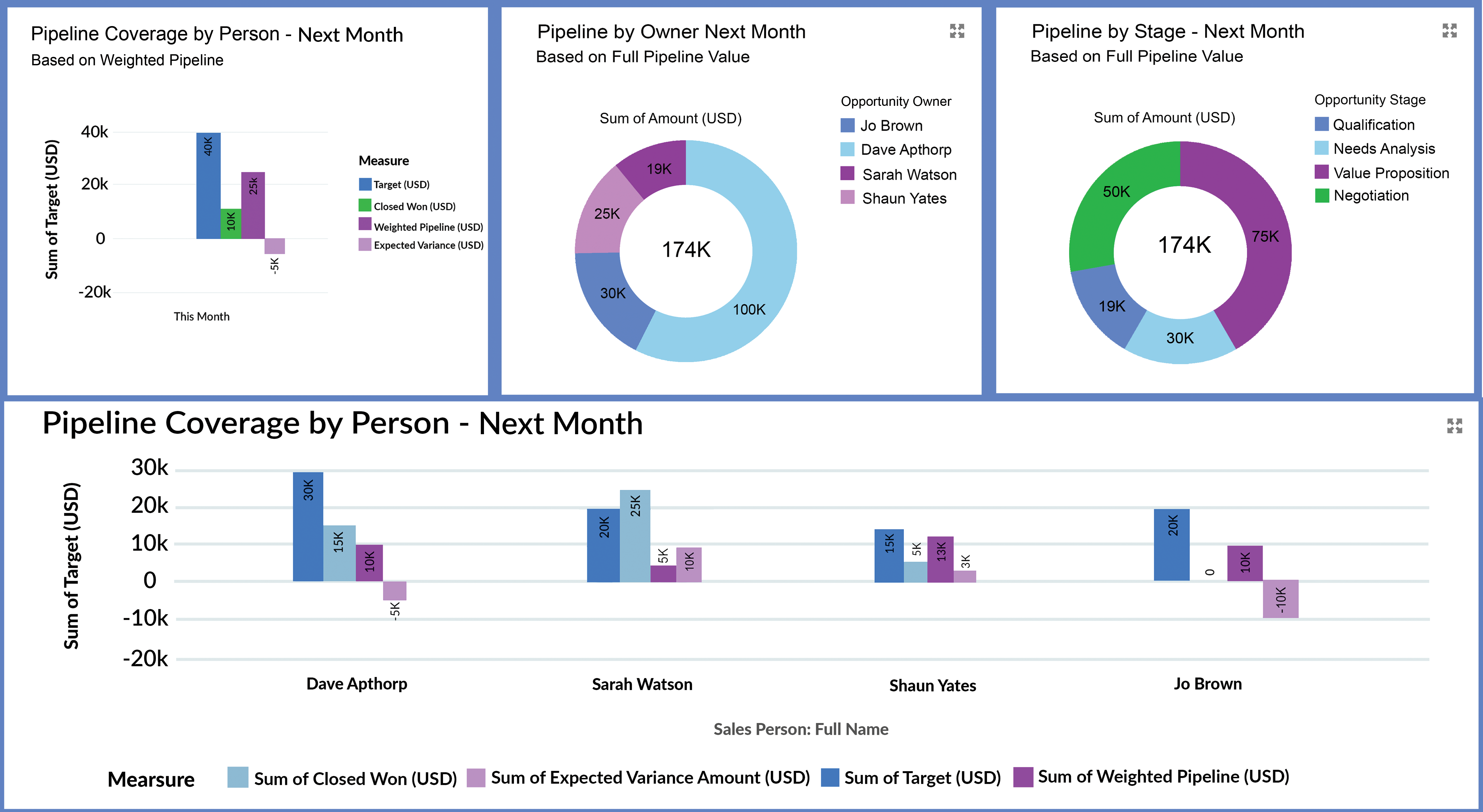
Why This Matters
Sales managers naturally focus on short-term goals, often zeroing in on the current month. However, successful sales leaders also keep an eye on the future, regularly asking, “Do I have enough pipeline coverage to meet next month's sales target?”. Proactively tracking next month's pipeline ensures you are prepared, reduces last-minute stress, strengthens your team's strategy, and paves the way for consistent success.
3 Best Practice Tips
- Identify and address risky opportunities: carefully assess deals in next month's pipeline, especially those with a low probability of closing. Since next month's success relies entirely on pipeline opportunities, prioritize identifying and mitigating potential risks.
- Avoid rushing deals prematurely: resist the temptation to pull next month's deals forward by offering discounts or concessions to close them early. This approach can erode margins and compromise overall profitability. Focus on advancing opportunities naturally and sustainably.
- Adjust the opportunity probability: while probability aligns with the stage, it remains flexible. Skilled sales managers guide their teams to adjust probabilities based on specific risks or positive factors in the deal. This approach enhances the weighted value's reliability and increases confidence in the pipeline coverage report.
Will You Hit Your Sales Target This Quarter?
This section mirrors the format for tracking sales versus target in the This Month and Next Month sections. In the charts below, you can:
- Summarize the pipeline coverage for the fiscal quarter. If you're partway through the quarter, we hope to find some deals already in the Closed Won column.
- Analyze the pipeline for the quarter by Owner and Stage.
- Provide critical information on the sales performance and pipeline coverage in the quarter for each salesperson.
As with the This Month and Next Month sections, review the charts carefully, focusing on weeding out deals that no longer have legs. And drill down to the reports for the Owner and Stage analysis to review the opportunities that make up each summary number.
Do You Have Visibility of Your Total Pipeline Coverage?
This section of the Sales Manager Dashboard contains two charts and reports, which are essential for successful funnel management:
- Total Open Pipeline by Close Date and Stage
- Open Opportunities Stacked by Owner
1. Total Open Pipeline by Close Date and Stage
What it Shows
This chart displays all open opportunities segmented by Close Date and stacked by Stage, which gives you a clear view of short-, mid-, and long-term pipeline health.
Why This Matters
- Understand overall pipeline balance: for example, the near-term pipeline should predominantly contain late-stage deals. In contrast, the further out we go, the more there should be a mix of mid and late-stage opportunities.
- Spot gaps early: identifies potential shortfalls in the mid- and long-term funnel. This information helps you take proactive steps to drive up the overall pipeline, like launching marketing campaigns or business development initiatives, to increase pipeline coverage.
3 Best Practice Tips
- Validate outliers: watch for early-stage deals with short-term close dates or late-stage deals with far-off close dates. These anomalies can distort your pipeline coverage metrics.
- Address past-due opportunities: resolve open deals with Close Dates in the past. Unless you have a time-turner, these deals will not close in the past.
- Beware of year-end spikes: if the pipeline surges toward the financial or calendar year's end, investigate whether these deals are realistic or merely shunted to later dates because the customer has no genuine buying intent.
2. Open Opportunities Stacked by Owner
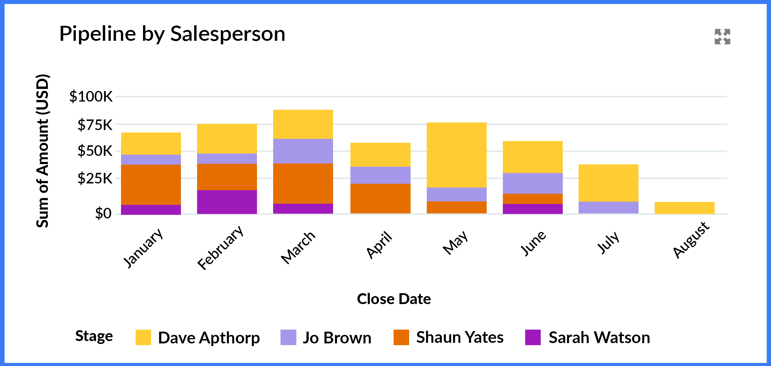
What it Shows
This chart adds further insight by stacking the pipeline by the opportunity owner, so you can see who drives short- and long-term revenue opportunities.
Why This Matters
- Spot top performers and gaps: quickly assess which salespeople contribute most to pipeline coverage.
- Validate balance: drill into the report to verify if individual pipelines are correctly balanced. For example, check for months in which the deals from one or two salespeople dominate the funnel.
- Identify coaching opportunities: pinpoint team members who need support building or advancing their pipeline.
3 Best Practice Tips
- Cross-check against conversion rates: compare this chart with opportunity conversion reports to uncover potential sandbagging. High win rates might indicate that reps create opportunities only when deals are nearly closed.
- Filter by owner: use the dashboard's filters to focus on individual salespeople—coach team members with low or unbalanced pipelines on creating new opportunities and advancing existing ones.
- Review mismatches: investigate deals where the Stage and Close Date don't align.
Tracking Annual Pipeline Coverage to Protect Your Sales Targets
Finally, this section of the Sales Manager Dashboard includes two key charts designed to help you monitor performance against annual and monthly sales targets.
- Pipeline Coverage vs. Total Year Target
- Closed Won by Owner This Year
1. Pipeline Coverage vs. Total Year Sales Target
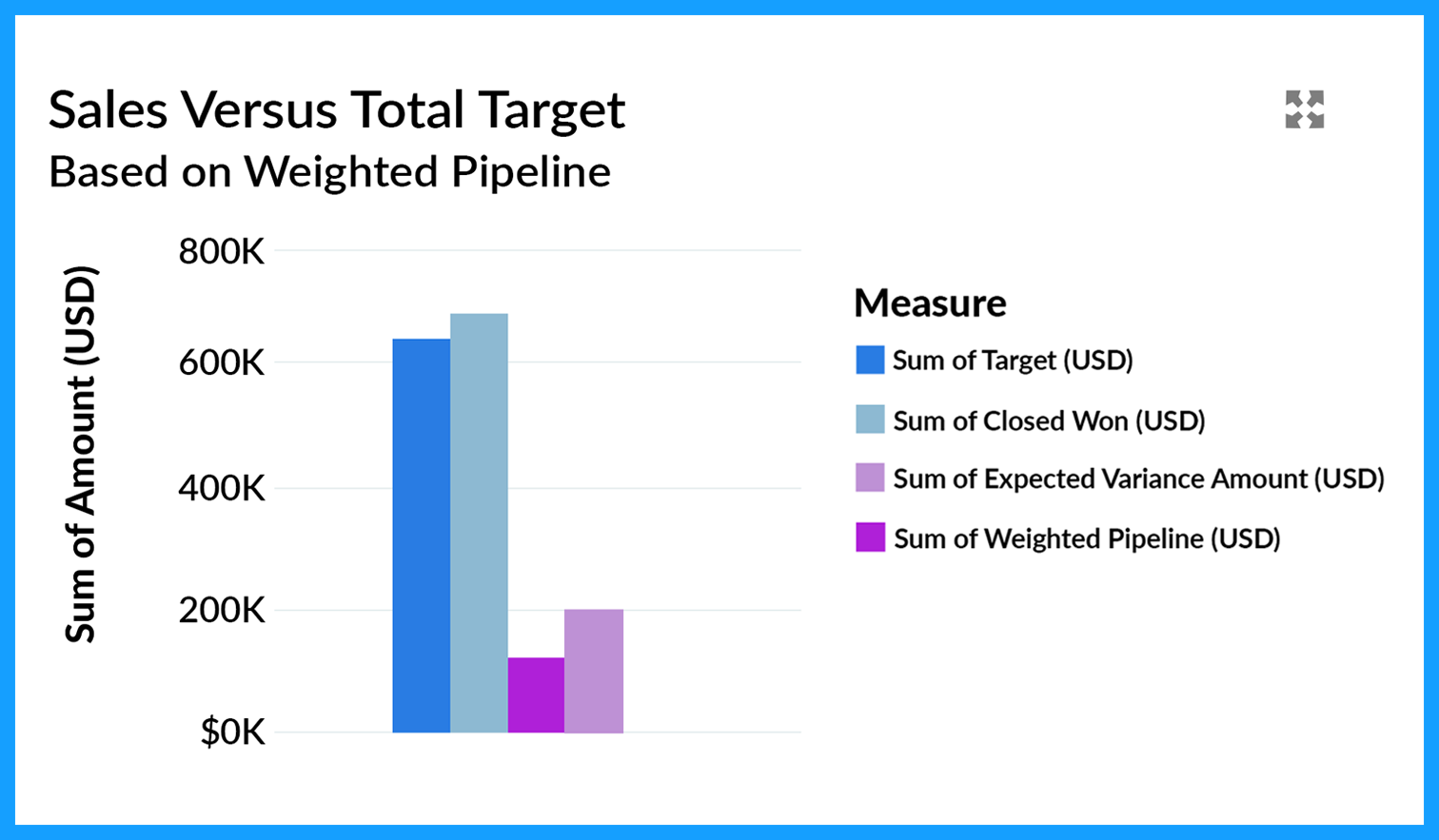
What it Shows
This chart compares the total annual sales target to actual performance. It combines the sum of all team members' sales targets with the value of closed-won deals and weighted opportunities.
Why This Matters
The chart offers a clear snapshot of year-to-date progress, helping you assess whether you are on track to meet the company's annual sales target. As such, the chart often highlights whether a gap must be closed with additional pipeline creation.
2 Best Practice Tips
- Start with the pipeline coverage charts: the opportunity tables earlier in the dashboard help ensure your overall forecast is realistic.
- Evaluate pipeline creation trends regularly: collaborate with team members to verify whether enough new opportunities are being generated to bridge gaps.
2. Month-on-Month Target Performance
This chart summarizes our month-on-month performance for the year.

What it Shows
This chart tracks monthly performance against sales targets. It displays actual closed-won revenue, targets, and any variances for past and current months. It highlights sales targets, the weighted pipeline, and projected variances for future months. Managers can drill into reports for a detailed view of individual sales performance.
Why This Matters
- It provides complete visibility into sales performance and is essential for keeping stakeholders informed.
- Offers instant insight into whether pipeline coverage is adequate to meet future targets.
- The underlying reports are valuable for managing individual salesperson performance.
2 Best Practice Tips
- Build momentum: while future months may show pipeline gaps, ensure sufficient lead generation and business development activities are underway to build momentum.
- Review individual performance trends regularly: strive for consistent results across the team, even if individual monthly achievements vary.
How To Master Your Pipeline Coverage
The Sales Manager Dashboard is integral to the GSP Target Tracker, which helps you track sales versus target at the salesperson, team, product, and company levels. It’s the easiest, most straightforward, and powerful way to keep on top of sales targets in Salesforce.
Try it for yourself.
Simply install GSP Target Tracker from the AppExchange Listing for a free 14-day trial. And if you have any questions, or would like a member of our team to walk you through it, just contact us.
Pipeline Coverage: FAQs
- Review the quality of the existing deals: specifically, validate that there are no dormant deals in the pipeline that will overinflate the level of coverage. Similarly, check that there are no active deals waiting to be recorded.
- Review pipeline coverage by the sales team and the salesperson: this step lets you identify specific areas and reps at risk of missing quota.
- Plan and take remedial action: to do this, identify gaps requiring a pipeline coverage boost and ensure a robust close plan for essential opportunities. At this time, you can also determine the marketing and business development activities necessary for pipeline coverage growth.
Still Flying Blind on Targets and Pipeline Coverage?
Book a free 45-minute demo. Tell us how you currently track targets and pipeline coverage — we'll show you exactly how Target Tracker fixes it, no strings attached.
Free Personalized Demo · 45-Minute Video Call · You Set the Agenda