The #1 Salesforce Pipeline Report to Use This Year
Have you discovered the BEST Salesforce pipeline report yet? And do you have the 3 pipeline quality metrics you need to assess funnel strength?
Last updated June 3, 2026


Download the 12 Must-Have Charts for Your Salesforce Dashboard eBook today!
Nothing is more valuable to a sales manager than a Salesforce pipeline report and a dashboard chart, because together they provide the visibility into the funnel needed for robust reviews and accurate sales forecasts.
That’s why this article has everything you need to know about the best Salesforce sales pipeline report and dashboard chart.
I’ll explain precisely how to use both. And show you how to get both items into Salesforce system quickly and easily.
Bottom line:
If you want more benefits from Salesforce dashboards, you’ll love this pipeline report and chart. It’s my favorite in our 12 Must-Have Salesforce Dashboard Charts.
What is the Best Salesforce Pipeline Chart?
The best Salesforce pipeline report is by Close Month and Opportunity Stage. This funnel report displays the total and weighted values of Opportunities due to close each month, grouped by Opportunity stage.
What makes it so valuable is that it provides baseline information for accurate forecasting, managing the sales pipeline, and tracking sales versus target.
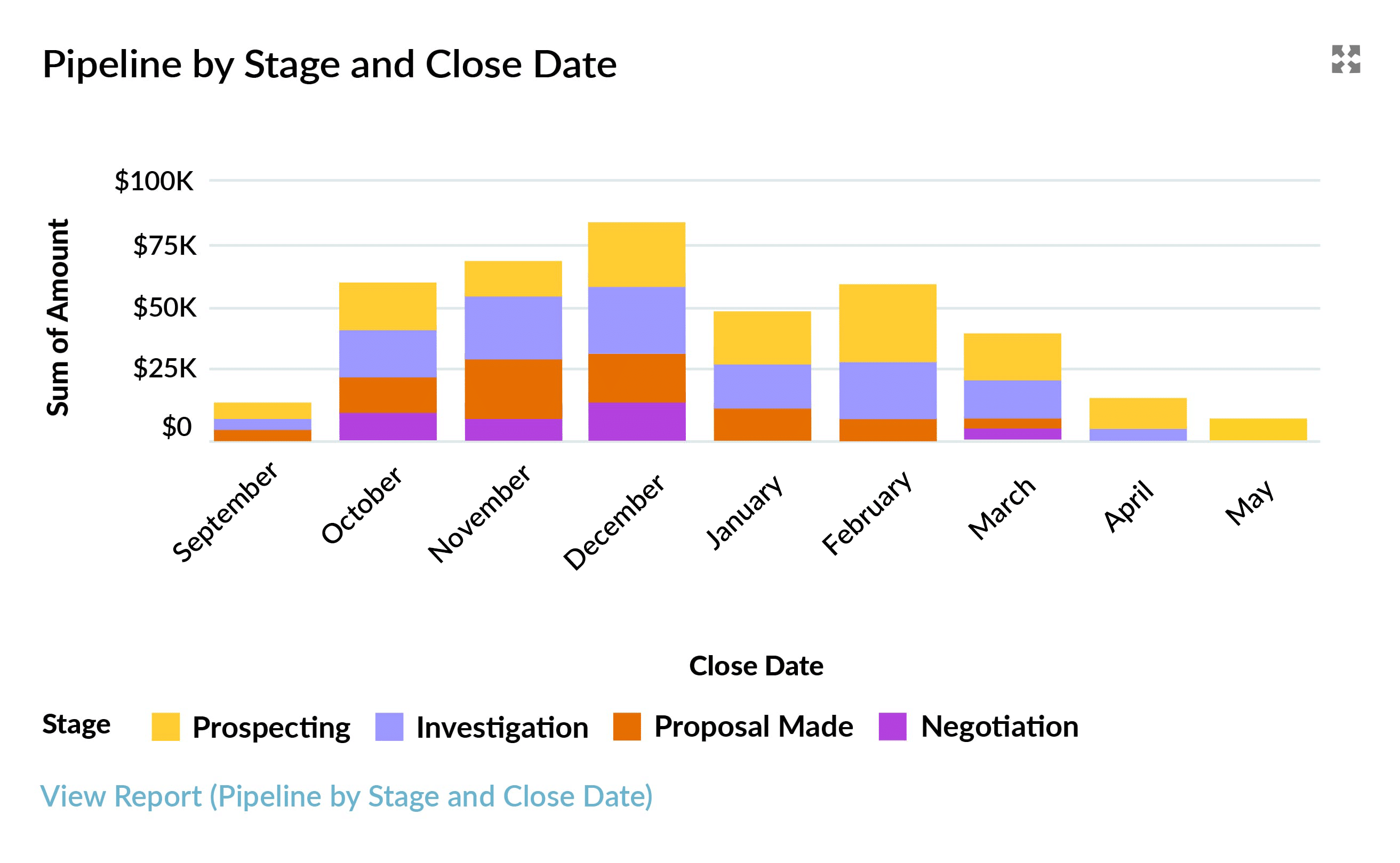
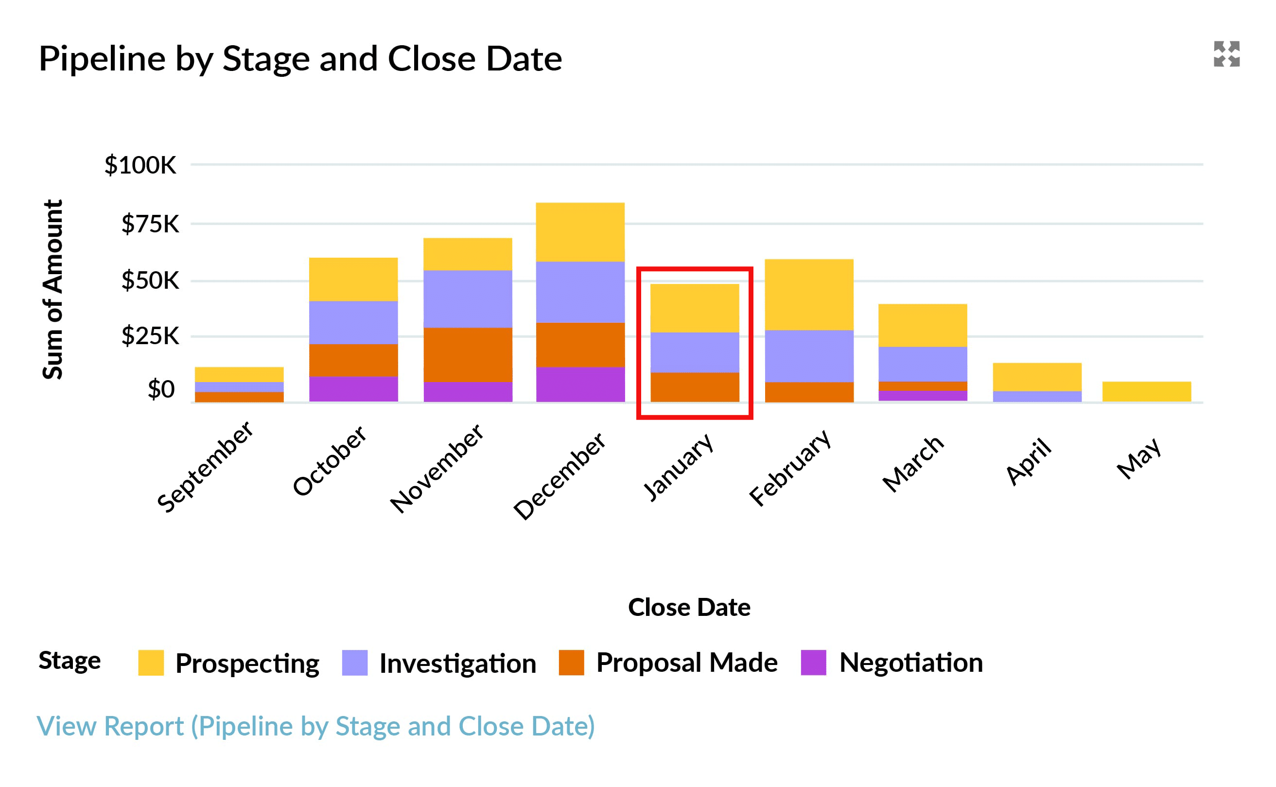
The following example shows a Salesforce dashboard pipeline chart. Let’s assume we are in early October right now.
The chart shows that $60k of the pipeline is due to close this month, of which around $ 11k is in the Negotiation Stage. In Salesforce, you can also hover over each segment to see this information.
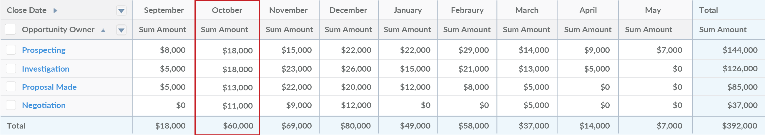
By simply clicking the View Report link below the chart, you can see the exact numbers in the underlying pipeline coverage report:
How Do You Use Salesforce Pipeline Reports?
The best way to explain how to use Salesforce pipeline reports is by sharing an example. So, let’s assume you are a sales leader in a B2B business with a 3 month sales cycle.
Salesforce Pipeline Report for the Current Month
We’re still in October right now, so let’s see what the pipeline report says:
There are $60k of Opportunities due to close. By looking at the chart or hovering over each segment, we can see that:
- $11k is in Negotiation
- $13k is in Proposal Stage
- $18k is still in the Investigation Stage
- $18k is also in Investigation
Given the sales cycle is typically 3 months, you’d be right to be concerned. As a sales manager, your priority is to have a robust pipeline. So, will the opportunities that make up these numbers really close this month?
To find out, you can drill down into the pipeline coverage report to investigate individual opportunities.
Salesforce Opportunity Reporting
We can click any number in the report to see the underlying opportunities:

Depending on the size of your sales team, you may already be familiar with many of the opportunities you can see in the report (we’ll take a closer look at some examples shortly).
Reviewing the Salesforce Opportunity Report
Take a moment to think about the deals in each opportunity stage. For example, if the average sales cycle is 3 months, you want to feel confident that the deals currently in the Prospecting stage will close this month. Ask yourself:
- Should some of these opportunities be at a more advanced stage?
- Do the close dates need to be moved to a later month?
- Have the close dates on some of these opportunities already slipped from one month to another?
If the answer to any of these questions is yes, it means you do not have robust pipeline visibility, and there may be waterlogging in your funnel – in other words, dormant deals may be swamping your sales pipeline.
The same is true of opportunities in the Investigation and Proposal Made stages. If you’re unlikely to close them this month, your October pipeline is significantly overinflated.
Now look closely at the deals in the Negotiation stage.
Right-click on an opportunity name to open the deal in a new tab. As an experienced sales manager, to be confident this opportunity will successfully close this month, you’re likely to be looking for a Close Plan, mutually agreed with the customer.
Ask yourself:
- Are there activities demonstrating that we are engaged with all stakeholders?
- Are any discounts approved by the relevant authority within our company?
- Has the contract been sent to the customer and reviewed by their legal team?
If you have GSP Target Tracker installed, you’ll also want to check the critical deal quality metrics (more on this later).
Salesforce Pipeline Report for the End-of-Year Month
Let’s look at another month in the pipeline coverage report: December. Let’s assume this is the final month in your financial year.
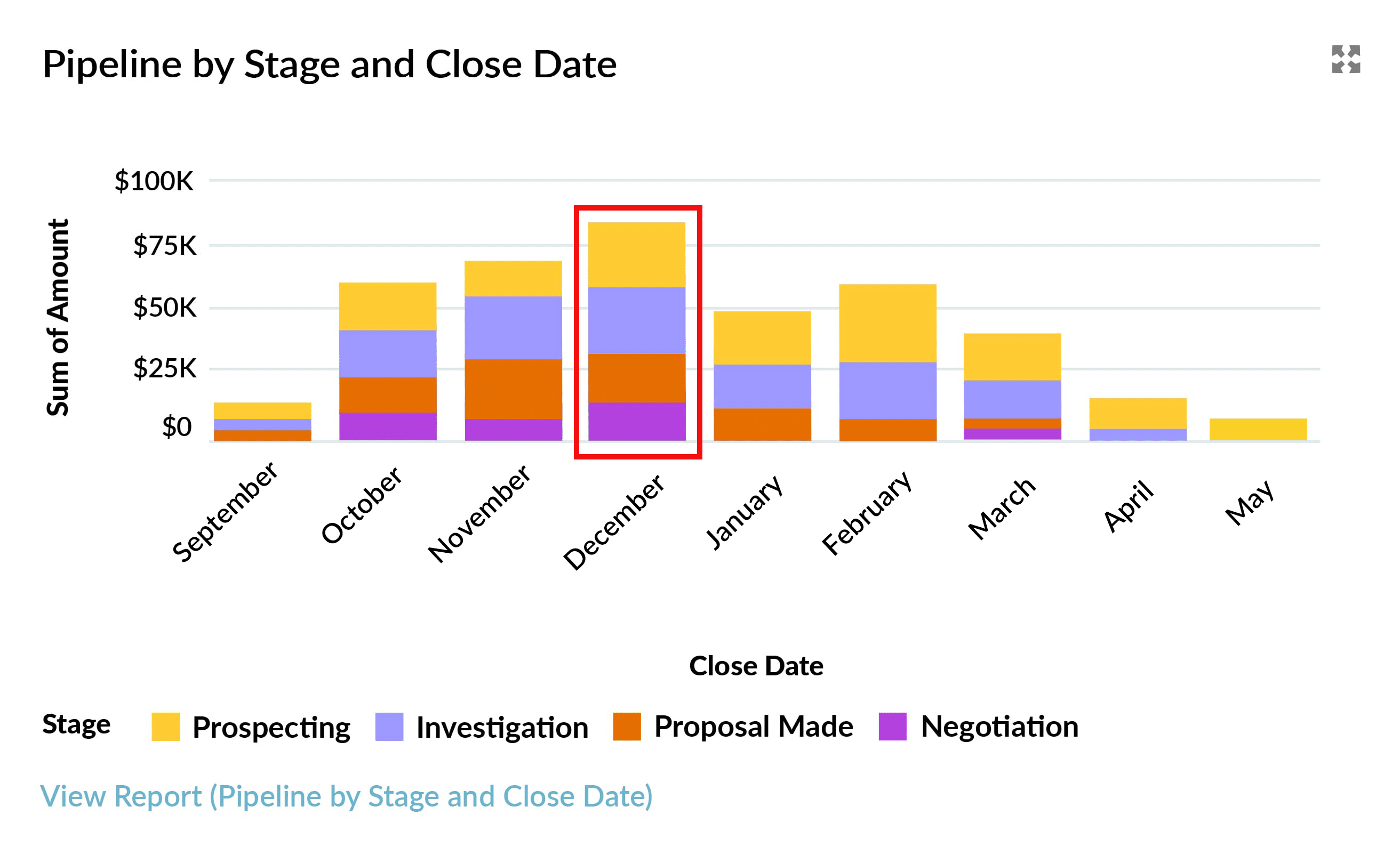
The dashboard chart shows that the funnel contains many deals due to close at the end of the year. Ask yourself:
- Are these deals in December because the financial year of many customers ends that month?
- If so, can we legitimately expect these deals to be completed in the run-up to Christmas?
- Have your December deals been sitting in the pipeline for a long time?
Often, salespeople feel under pressure earlier in the year to boost the size of their pipeline. In some businesses, salespeople enter December as the close date, thinking the Opportunity is bound to close sometime during the year. If that is the case, it means your December pipeline is nowhere near as reliable as we hope it is.
So again, take a hard look at the opportunities in each stage.
Salesforce Dashboard Pipeline Chart for January
Your Salesforce dashboard pipeline chart shows a dip in funnel size in January.
This dip could be due to a legitimate seasonal variation. Alternatively, it could be something you need to be concerned about – your pipeline coverage report is telling you to start organizing marketing campaigns using Salesforce to boost your pipeline coverage 3 months from now.
Pipeline Reports in Salesforce for Deals Due to Close in Earlier Months
Let’s stick with the assumption that right now, we’re in the middle of October. Why does our Salesforce pipeline report still contain deals for September?
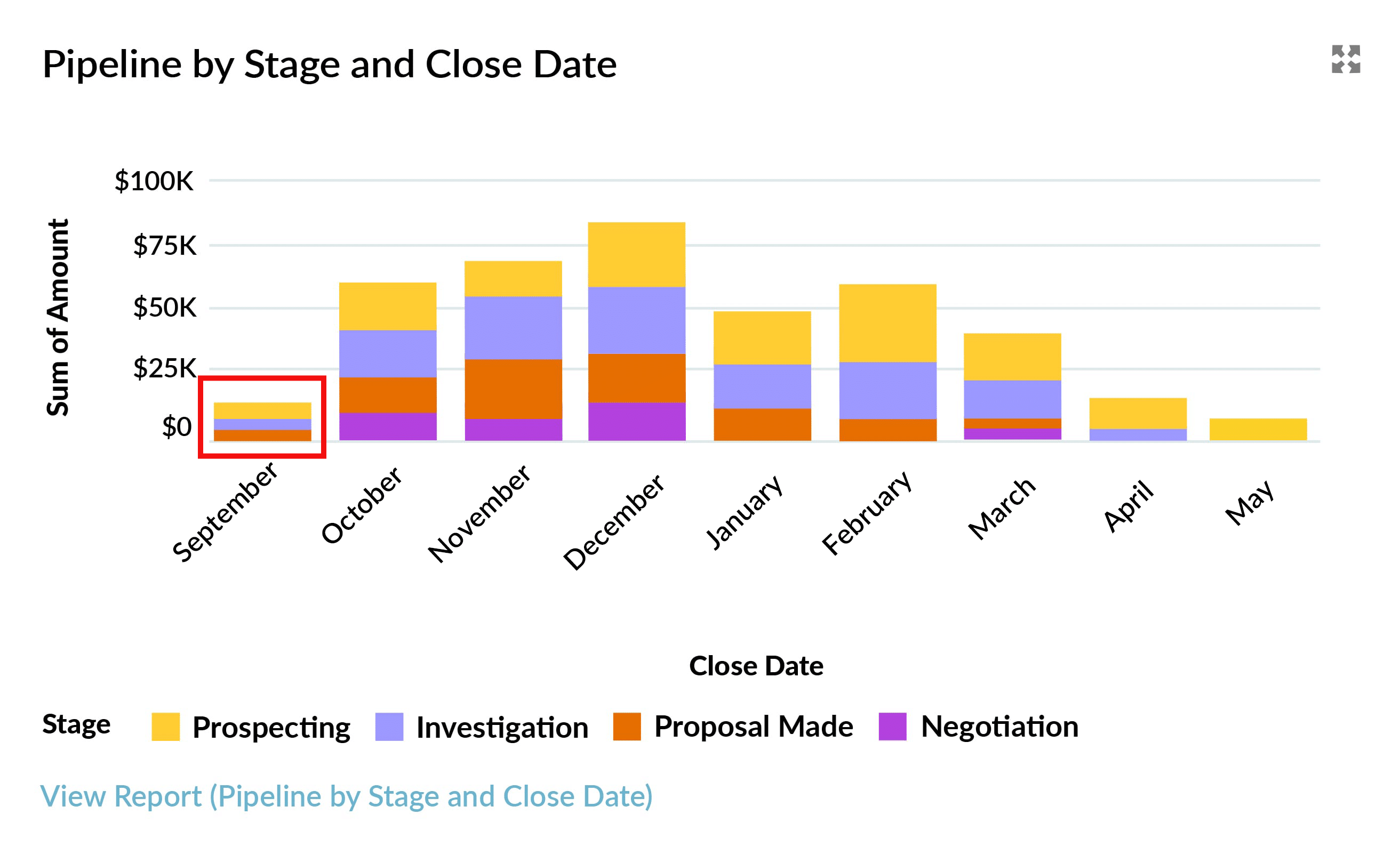
Unless you have a time-turner, those deals aren’t going to close in September. But this is a problem we often see: open opportunities have past close dates. Either:
- Those deals are closed, and the opportunity stage is not up to date.
- The close date needs to be moved because the opportunities are still open.
What Pipeline Quality Metrics Should Your Funnel Report Contain?
The best way to determine whether you can rely on pipeline opportunities is to review three deal quality metrics:
- # Close Date Month Changes
- # Days Open
- # Days Since Last Stage Change.
Together, these pipeline quality metrics help you assess the strength of your sales pipeline – particularly those closing this month and next month.
To get these metrics, use one of the following apps:
- GSP Sales Dashboard: contains the 12 must-have Salesforce dashboard pipeline charts every sales leader needs.
- GSP Target Tracker: uses funnel reports in Salesforce to assess pipeline coverage versus quota.
For maximum impact, incorporate the 3 metrics into the details of your pipeline report in Salesforce to make it easy to identify deals at high risk of slipping from your forecast.
Start Using Salesforce Pipeline Reports to Measure Your Coverage
GSP Target Tracker includes built-in Salesforce pipeline reports that let you measure coverage versus quota at the rep, team, region, company, and product levels. The app provides the missing Target tab in Salesforce – plus a comprehensive way to compare sales performance and funnel coverage against quota.
Salesforce Pipeline Reports: FAQs
A pipeline report in Salesforce provides your salespeople and business leaders with clear visibility of the volume and value (total and weighted) of opportunities within the sales funnel. The pipeline coverage report categorizes sales deals by useful parameters, including opportunity stage and close date. A dashboard chart or report graph in Salesforce enables users to easily assimilate the information at-a-glance, while the drill-down feature means you can quickly dig into the details when needed.
Got a Salesforce Challenge you'd like advice on?
Book a free 45-minute consultation with one of our Salesforce experts. You choose the topic - we'll give you practical, honest recommendations on how to improve.
Free Salesforce Review | 45 Minute Web Meeting | You Choose The Topic