How To Track Whether Your Funnel Is Growing Or Shrinking
How to keep your pipeline moving in the right direction with smarter Salesforce dashboards.
Last updated June 3, 2026


Download the 12 Must-Have Charts for Your Salesforce Dashboard eBook today!
Tracking your sales pipeline trend is essential because, all other things being equal, you cannot increase sales if your funnel growth is flat.
Or even worse, if it’s heading downhill.
In other words, managers need clarity on the trend in the size of their sales pipeline over the long, medium, and short-term.
So, if you want to measure your sales pipeline growth using Salesforce dashboards and reports, then you’ll love this blog post.
As a bonus, I’ll also show you where you can quickly get the opportunity trend reports for free without building them yourself.
(Of course, size isn’t everything. You’ll also want to use these three pipeline quality metrics).
With that, let’s kick things off by tracking the long-term pipeline trend.
Long-term Sales Pipeline Trend
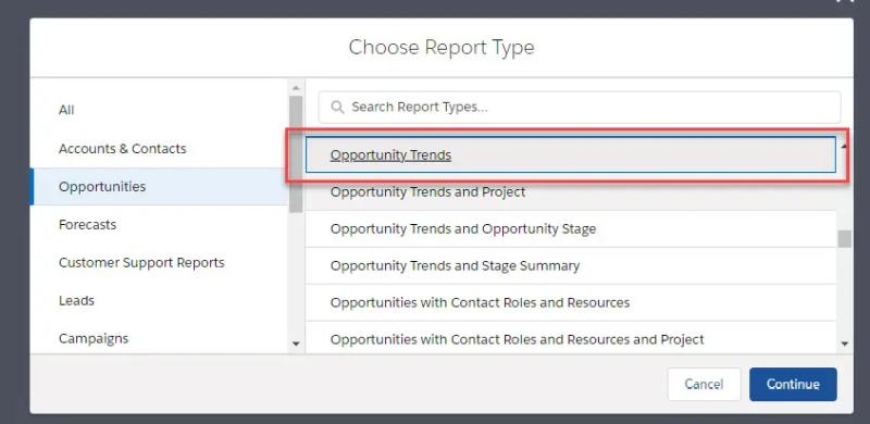
The specific Salesforce report you need to get visibility of the long-term trend in your sales pipeline is the Opportunity Trends report.
However, I prefer to call it the Pipeline As-At report.
That’s because the report shows the actual size of the funnel ‘As-At’ the first day of each month.
As a result, it gives terrific insight into the medium and long-term trends in the sales funnel size.
Opportunity Trends Report Example
In this example, we see the funnel was shrinking for three months towards the end of 2021.

Fortunately, the overall size of the pipeline has grown for the last three months.
As long as the deals are high-quality, that means we are in a good place for the first half of the year.
How the Opportunity Trends Report Works
The Opportunity Trends report shows all open opportunities in the funnel on the 1st of each month. It doesn’t matter if the deal is due to close in a later month; the report shows the total pipeline on the first day of each month.
Let’s walk through an example:
Let’s say there’s an opportunity in the Prospecting Stage on January 1. Therefore, the January column on the chart includes this deal, and specifically, it’s in the Prospecting group.
It doesn’t matter what later happens to the opportunity; it always shows in the January column because it was a pipeline deal on the first day of that month.
Next, let’s say it’s moved onto the Investigation Stage by the start of February.
Therefore, the opportunity appears in the February column.
Of course, it also continues to appear in the January column.
However, in mid-March, the deal is qualified out and the stage set to Closed Lost.
Therefore, the opportunity appears in the report’s January, February, and March columns.
Remember, it’s included in March because, on March 1, the deal was open.
However, it doesn’t appear next month because the opportunity was not in the pipeline on April 1.
Even so, the deal is always in the January, February, and March columns. That’s because As-At the first day of those months, the deal was in the pipeline.
In other words, the Opportunity Trends report shows the overall size of the pipeline at the start of each month. That’s irrespective of when those deals are due to close.
Analyzing Long-term Pipeline Trends
To get more detail on the sales pipeline trend, drill down to the underlying report.

If you want more detail on the sales pipeline trend, drill down to the report.
The report shows the specific numbers for each of the historical stages.
For example, the Negotiation stage was flat over the last three months, even though the overall size of the pipeline has grown.
That’s because the upward trend in sales pipeline size is primarily in the Prospecting and Investigation stages.
Understanding Trends in the Long-term Pipeline
What do we make of the trends in this example?
Are we surprised? Should we even be concerned?
Of course, only you know that in the context of your business.
However, here are four examples of conclusions we can draw from historical trends in this pipeline report.
1. The downward pipeline trend
On the face of it, a downward trend in pipeline size is not good news.
Even so, it depends upon the reason.
If you’ve had a great quarter in winning new business, your pipeline will naturally reduce. However, the chart is warning you not to neglect prospecting activities.
Here’s another example. Let’s say you have weeded out dormant deals. In other words, opportunities that, with the best will in the world, are never going to close successfully.
If you’ve got rid of the junk, then your pipeline size will clearly trend downwards, in the short-term at least.
On the other hand, your visibility of the true funnel is dramatically improved.
Here’s the blog post that helps you weed out poor quality deals:
Spot Poor Quality Deals Using Salesforce Dashboards.
2. The negative early-stage pipeline trend
Take a look at the chart below. It’s the opportunity trends report taken from one of our Salesforce clients.
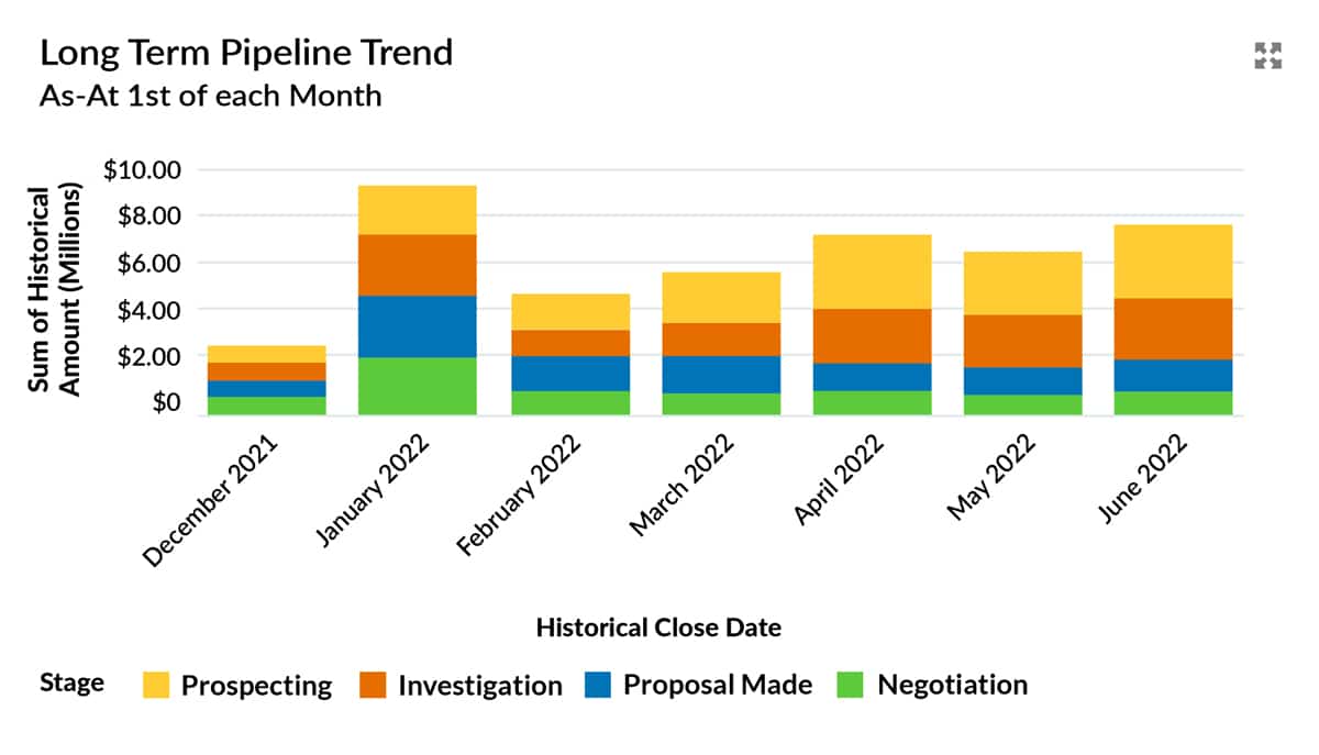
Take a look at the chart below. It’s the opportunity trends chart from one of our customers.
As you can see, there was a big jump in the pipeline in January. Is that growth genuine? Perhaps not.
In this case, the sales team was under pressure to build the funnel at the start of the year. They created many hopeful deals with customers and prospects in Salesforce.
Are these genuine, well-qualified opportunities? No, not in many cases.
Yet it’s a trend I often see.
Unfortunately, this means there’s misleading growth in the opportunity trends report.
To correct this, the new VP of Sales is helping the sales team build key account plans rather than pseudo opportunities.
These plans explain how the sales team will develop customer and prospect relationships that produce legitimate pipeline opportunities.
To learn more, use this blog post:
Here’s How To Build Powerful Account Plans In Salesforce.
3. The positive trend in the early-stage pipeline
Let’s assume you are confident in the pipeline quality. That means it’s good that there’s growth in the early-stage funnel.
In other words, you’re building a funnel that will wash through into a revenue increase down the line.
So you probably want to know where this growth has come from, right?
For example, is it due to increased Leads converting into opportunities? Or, are more opportunities created on existing Accounts?
In other words, are we seeing a trend in new logos, or are we farming the existing customer base more skillfully?
Here’s a great free resource to analyze that: Lead Conversion Dashboard. You can download it for free from the AppExchange.
We built this dashboard to provide vital insight into where opportunities have come from and what happens to them.
For example, the dashboard lets you compare these two metrics: the win rate on opportunities from converted Leads versus the rate on opportunities created directly on Accounts.
I recommend using the dashboard for extra insight in understanding pipeline growth.

Use the dashboard in conjunction with the Opportunity Trends report for extra insight when analyzing trends in pipeline growth.
4. The end of year sales pipeline trend
In many companies, there’s only one thing that matters in Q4.
That is closing existing deals.
Often, nothing else gets a look-in.
That means there’s a downward trend in the size of the pipeline. That happens for two reasons.
First, no new opportunities get created. The sales team is focused solely on closing existing deals.
Second, existing deals are set to Won or Lost, which means they come out of the pipeline.
So naturally, the total pipeline size trends down.
However, how do you know that this focus on closing deals is why the funnel size shrinks?
First, look at the Closed Won sales chart. It’s positive if there’s an upward trend. In other words, deals are coming out of the pipeline and turning into revenue.

Second, look at the Deals Lost chart. That may also be increasing because salespeople are closing out no-win opportunities.

Third, examine the dashboard chart that shows the number of deals created.
You’ll likely see very few new opportunities.

These charts mean you can judge whether there’s a legitimate shrinking of the pipeline due to short-term sales focus.
How to get the long-term pipeline trend report
You might be wondering:
How do I get the As-At report that shows the long-term pipeline trend?
You’ve two options:
First, build it yourself. You’ll need an Opportunities Trends report type.

Second, install the GSP Sales Dashboard from the AppExchange. If your company is using Salesforce Enterprise Edition, you need this dashboard.
Short-Term Pipeline Trend
The As-At report is excellent: It tells us about the pipeline size trend over the long and medium terms.
However, what about short-term pipeline trends? How has the funnel changed over the last few weeks?
Here’s the Salesforce dashboard chart that does that. It’s called Opportunities with Historical Trending.

Remember that you must have Enterprise Edition or above to use this report. That’s because you need the Historical Trends feature, which isn’t available in Professional Edition.
This short-term pipeline trend chart gives the insight needed for day-to-day reviews and analysis.
We set the report to provide snapshots for the last six weeks in this example.
That means the chart measures the short-term impact of marketing campaigns and lead generation activity.
Again, the Salesforce report gives more detail on the sales pipeline trend:

To create this type of Salesforce report, start by enabling the Historical Trends reporting function.
To do this, click Setup, Customize, Reports & Dashboards, Historical Trending.
Check the box ‘Enable Historical Trending’ for Opportunities.

Then, when you create a new report, Opportunities with Historical Trending is an option under the Opportunities report types.
Got a Salesforce Challenge you'd like advice on?
Book a free 45-minute consultation with one of our Salesforce experts. You choose the topic - we'll give you practical, honest recommendations on how to improve.
Free Salesforce Review | 45 Minute Web Meeting | You Choose The Topic