Measure Sales Pipeline Size With These 4 Vital Dashboard Charts
How to get the full picture of your sales funnel with precise pipeline size tracking.
Last updated July 17, 2026


Download the 12 Must-Have Charts for Your Salesforce Dashboard eBook today!
Sales pipeline size matters.
Big is beautiful. That’s certainly the case when it comes to funnel size.
All other things being equal, of course.
That’s because bigger is better, assuming the sales pipeline only contains deals of the right quality. Fortunately, you can use these sales pipeline quality metrics to monitor the quality of your funnel.
Nevertheless, let’s focus here on the sales pipeline size.
In particular, I’ll show you how these four Salesforce dashboard charts and underlying reports accurately measure the size of your sales funnel.
By the way, you’re probably wondering:
How do I get my hands on these four dashboard charts?
Easy.
Install the GSP Sales Dashboard for Enterprise Edition.
Each dashboard contains the 12 charts and underlying reports I recommend for sales funnel reviews and pipeline tracking using Salesforce.
1. Measure sales pipeline size by Close Date and Stage
If you only use one dashboard chart that measures sales pipeline size, then make it this one.
Why?
It’s because this chart is the starting point for any funnel review focusing on pipeline size.
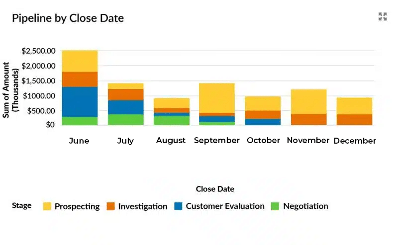
The dashboard chart shows the sales pipeline size by Close Date. Within each month, the individual segments group the funnel by Opportunity Stage.
Why the Close Date and Stage dashboard chart is useful
Use this chart to assess the size and strength of the pipeline. Do this for the current month, current quarter and further into the future.
For example, here are three key areas our pipeline review should focus upon based on the example chart above.
- Pipeline size this month.
Let’s suppose we are at the beginning of March 2019. The dashboard chart shows there is $2.5 million due to close this month. Now, let’s assume the typical sales cycle is three months. In that case, can deals in the Prospecting and Investigation Stages can be relied upon to close successfully this month? - Negotiation Stage.
May and June both have deals at the Negotiation Stage. Is it going to take several months to conclude these opportunities? Maybe. However, what has to happen to bring these deals forward? - Longer-term pipeline.
There’s a substantial funnel due to close in August. Is it realistic that this will happen during the holiday period? Likewise, there’s also a significant pipeline due to close in September. If, for example, this is our company’s financial year-end, is there a compelling reason why more deals will close this month? For example, often, the last month in the year is entered into opportunities based on, “well, it’s bound to close sometime this year.” If this is the case, then the longer-term funnel size is probably overstated.
For more details on measuring sales pipeline size using the Close Date and Stage dashboard chart, read “If You Only Create One Chart Make It This One.”
Prefer a video? Here’s where I demonstrate the specific use of this funnel report in sales pipeline reviews:
Close Dates in the past
There’s a common problem when implementing this dashboard chart.
It’s the same as that experienced by Colin Parish, VP of Modernis.
Colin’s team had lots of opportunities with Close Dates in the past. He said the chart looked more like a bedraggled washing line.
Fortunately, you can read how Colin resolved his opportunities with close dates in the past problem.
2. Measure sales pipeline size using the funnel chart
This chart measures the sales pipeline size in the form of a traditional sales funnel.
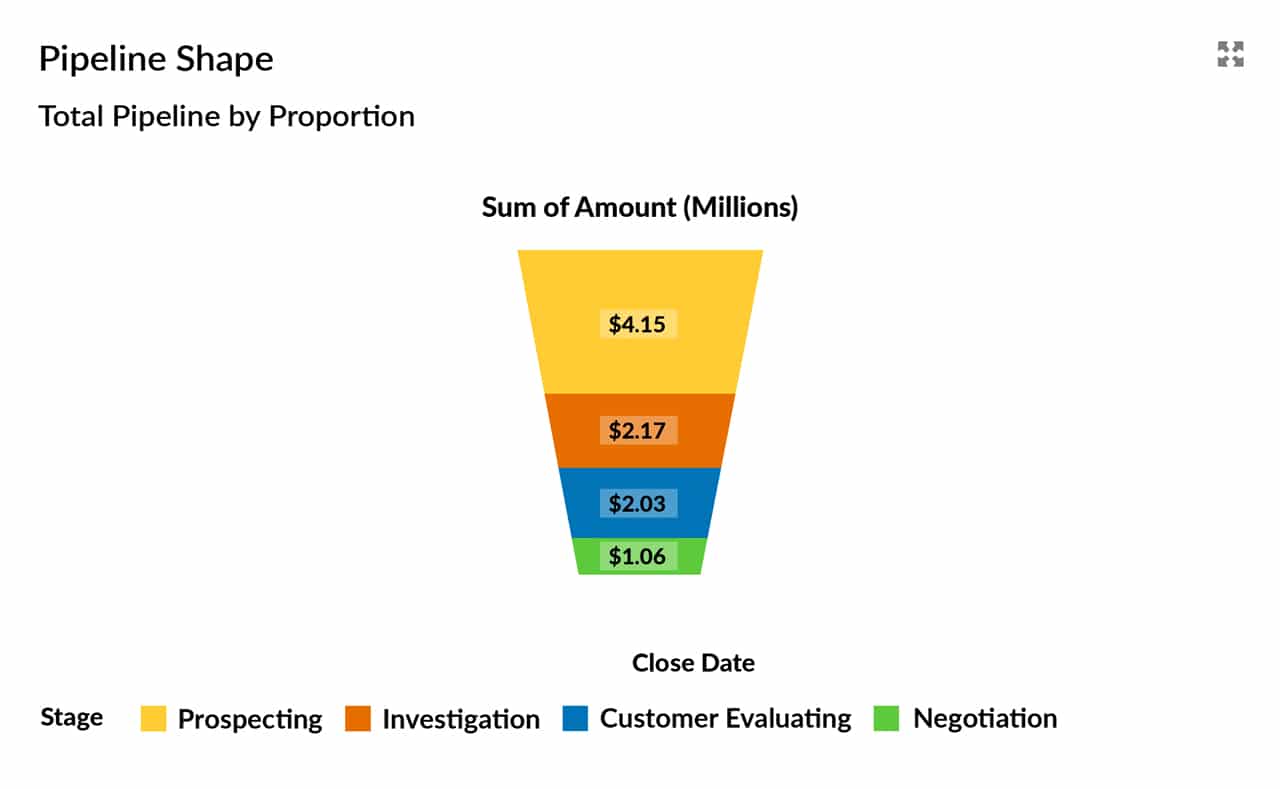
This chart is often the first Salesforce administrators create. That’s because it resembles a traditional funnel and it’s easy to produce.
Why this dashboard chart is useful
I have mixed views about this dashboard chart.
The funnel chart is an excellent way to check whether the pipeline is in proportion. In other words, does the overall shape of the funnel look healthy?
In the chart above, for example, the value of deals in the Investigating Stage and Customer Evaluating Stage is almost identical ($2.17 M versus $2.03 M). On the face of it, this suggests a shortage of sales pipeline in the earlier Investigating Stage. Potentially, our funnel is out of kilter.
Here’s another example. Look at the funnel size chart below.

The total pipeline value is the same. However, the pipeline is short of deals at the first Opportunity Stage, Prospecting. We need to ask, is this highlighting a sales revenue problem further down the line?
Nevertheless, there are several things to watch out for with this chart.
First:
There’s no time context. The chart shows the total pipeline size, irrespective of when those deals are likely to close. Therefore we may have lots of early-stage funnel, but it all has an unrealistic near-time close date. That’s why it is better to start with the Close Date and Stage chart highlighted earlier.
Second:
The overall shape of the dashboard chart doesn’t vary.
What does vary is the height of the slices within the funnel, and the numbers associated with each stage. That means you have to look carefully at the chart to make sure you’re interpreting it correctly.
So be careful.
Nevertheless, it’s useful to eyeball this pipeline size dashboard chart every week. It describes whether the total pipeline is in proportion. That’s a good reason to have it on your dashboard.
Watch this short video to hear me discussing the funnel chart with one of our consultants.
3. Pipeline size dashboard metrics
When is a dashboard chart, not a chart? When it’s a dashboard metric.
Here’s an example:

A Salesforce dashboard metric gives a single total figure. The underlying report contains the detail.
You can, therefore, quickly know the total size of the pipeline using a metric.
Here are two other examples:
First, the total value of open opportunities due to close this month:

Second, the size of the pipeline due to close next month:

Why this dashboard chart is useful
Dashboard metrics give an immediate measure of the overall size of the pipeline.
That means they’re an excellent ready-reckoner.
For example, you might use a rule-of-thumb to hit your sales target next month; for example, the pipeline coverage must be three times the quota amount. In other words, let’s say the target is $750,000. However, in this case, we only have 2x coverage based on our metric ($1.4 M).
So, all things being equal, we’ve got a problem.
Nevertheless, knowing that means we can potentially do something about it.
4. Pipeline Size Trend
This chart measures the trend in the size of the pipeline. It’s called the “As-At Historical Pipeline Trend” report and dashboard chart.
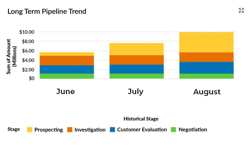
The chart shows the size of the pipeline ‘As-At’ the first day of each month. We can see that over three months, the trend is positive.
In other words, the pipeline is getting bigger.
Why this dashboard chart is useful
Effective managers know the sales pipeline size at any point in time.
But they also know the trend in the size of the pipeline. The trend tells sales managers whether they are doing the right things and moving in the right direction.
Incidentally, this dashboard chart also comes with a little sister. This alternative measures the trend in pipeline size on a daily and weekly basis. Read this blog post to find out more about measuring the trend in the sales pipeline size.
Alternatively, watch this video to see me demonstrate the pipeline trend chart in action.
Sales Pipeline Size Dashboard
You probably want all four of these charts on a single Salesforce dashboard.
Don’t forget:
To get your hands on these pipeline charts – and many others – install the FREE GSP Sales Dashboard for Enterprise Edition.
Alternatively, for help measuring the size and quality of your sales pipeline, don’t hesitate to get in touch.
Got a Salesforce Challenge you'd like advice on?
Book a free 45-minute consultation with one of our Salesforce experts. You choose the topic - we'll give you practical, honest recommendations on how to improve.
Free Salesforce Review | 45 Minute Web Meeting | You Choose The Topic