10 Best Practice Tips For High Impact Salesforce Dashboards
Elevate your sales insights by mastering dashboard design - making every metric count.
Last updated April 10, 2026
Your Salesforce dashboards should provide the complete visibility needed to drive sales performance.
However, you can boost your benefits with the straightforward best practices steps I outline in this article.
I’ve drawn these tips from the hundreds, probably thousands, of Salesforce reports and dashboard charts I’ve built over twenty years.
Based on that experience, here are my ten best practice tips and tricks for creating the best Salesforce Lightning dashboards:
- Use metrics with Charts to flash up totals.
- Add relevant Details fields to each report.
- Highlight critical dashboard charts with background shading.
- Use dashboards filters to hone in on vital areas.
- Pre-define colors for picklist fields.
- Use dashboard tables for a quick view of multiple records.
- Double-check dashboard titles and sub-titles.
- Use stacked summaries on reports (most of the time).
- Apply conditional formatting to highlight critical numbers.
- Choose the correct dashboard chart for the job.
With that, here’s an example of my first best practice tip.
1 – Use Metrics With Charts
A dashboard chart provides you with critical information on a specific metric. That might be revenue won by month for this financial year, for example.
Of course, you can hover over each month to see the sub-total. Or Show Values on charts that are not stacked.
Nevertheless, in our example, there’s a vital piece of information missing:
The total for the year. That’s likely something we want to know.
Drilling down from the chart to the report is one way to get that information. But it’s an unnecessary click.
Instead, my first best practice tip is to place metrics alongside the chart to summarize the data.
For example, straight away, we know the total revenue for the year is $1.1M. We can also see won deals for this quarter total $181K.
The dashboard chart to the right reveals the month-by-month breakdown for these figures over time.
In other words, using metrics alongside charts is a critical way to increase the value of that dashboard row.
2 – Add Relevant Detail Fields
Using metrics like those in our first example means we can avoid drilling down from the chart to the report.
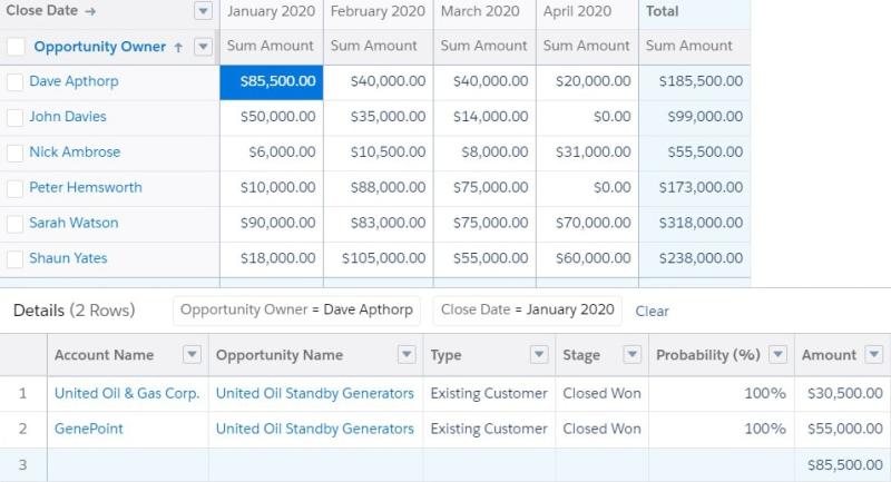
However, often you need more details. For example, perhaps you want to know more about the deals making up the figures for each month.
To do this, you click down to the report. Then, select a number in the report to see what makes up that figure.
This ability is an excellent feature of Lightning reports compared to Classic.
Nevertheless, here’s a common mistake I see:
Many unnecessary fields are displayed, which makes it confusing for people. And the reverse is often true; vital information is not visible.
This poor design happens because, by default, Salesforce adds many fields to the Detail section. Often, many of these are not that important to you.
On the other hand, critical details such as Stage, Owner, Type, and Amount are often pushed far to the right and not visible on your screen.
It’s dead simple to avoid this problem. Here’s my second best practices tip.
I recommend you carefully review the Detail section of the report. Remove any fields that don’t matter to you. Make sure the most valuable details are close to the top.
It only takes a few moments and the result is a more user-friendly report.
3 – Highlight Critical Dashboard Charts
Often, there’s one standout chart on the dashboard. The importance of this chart outweighs all the others.
In other words, if the user only looks at one chart, it should be this one.
My third best practice tip is to use highlighting to draw the eye to the most important chart.
You achieve this by editing the dashboard chart and adjusting the background color.
Simple but effective. I suggest you only do this on one chart or row on the dashboard.
4 – Use Dashboard Filters
Usually, you want to see sales performance and pipeline trends for the company, team, and individual.
However, you don’t want to create separate dashboards. That’s too much clicking for the user and a lot of work to maintain.
Instead, use dashboard filters. That’s my fourth best practice.
Selecting a filter value such as a salesperson means the dashboard runs for that opportunity owner—even the reports filter by that value when you drill down.
You can have up to three filters on each dashboard and 50 values on each filter. That’s enough for most sales organizations.
Here’s where you can find out more about dashboard filters.
5 – Define Colors For Picklist Fields
By default, Salesforce assigns colors dynamically to dashboard charts.
What does this mean?
It means the color for any picklist value is assigned ‘in the moment’ when you run the dashboard. In other words, there’s no advanced color setting for each picklist value.
Unfortunately, this means you can end up with, for example, Won showing in yellow on one dashboard chart and green on another.
That’s confusing for users.
Fortunately, you can solve this problem by assigning fixed colors to picklist values.
That means when you use the field in any dashboard chart, the color for each picklist value is always the same.
That makes it much easier to compare information between charts or across dashboards.
6 – Use Dashboard Tables
Sometimes it’s valuable to see more detail directly on the dashboard.
For example, you might want a list of opportunities due to close this month.
You can achieve this by using a Table.
In our example, you can see the essential standard fields, plus the pipeline quality metrics and KPIs.
Of course, you might be wondering:
How can I get these pipeline quality metrics into my own Salesforce system?
3 Pipeline Quality Metrics That Highlight When To Be Sceptical explains the metrics fully and how to get them for free.
7 – Double (Triple) Check Chart Titles
Here are two BIG mistakes people often make with dashboards:
First, the title and sub-title either don’t tally with the information in the chart.
And second, the titles don’t give the person enough insight into the precise parameters of the data.
You can solve this problem by carefully writing each title and sub-title.
Remember, the Lightning interface inserts the Report Title into the dashboard chart. However, that may not be sufficiently informative for users.
Instead, craft the title yourself.
If the chart has a complex set of filters, you can also add a footer to make this easy for people to understand.
Now it’s easy for users to immediately grasp what they are looking at.
8 – Use Stacked Summaries (Most Of The Time)
Stacked summaries change the way reports group data. It’s often a subtle difference but a powerful one.
Here’s the same report with Stacked Summaries switched on. The report is more compact with the feature on. (It’s quite hard to see the difference in the limited space of our screenshot. Try it for yourself on a report).
Toggle between the two using the control at the bottom of the report.
You’ll likely immediately know which version you prefer report by report.
9 – Use Conditional Formatting
Sometimes a report can have a lot of zeros or low numbers. This makes it hard for users to see vital information.
To solve this, use Conditional Highlighting in the report. However, be careful as this can result in a sea of colors that makes it hard for users to absorb the information.
Therefore, I recommend that you apply a little trick. Give non-essential values a null color.
This way, only the critical values are highlighted.
This way, you draw the eye to the vital numbers and make the report much easier to read.
10 – Use The Right Report For The Job
People sometimes make poor chart choices to display their information.
For example, the funnel chart is a popular choice:
As you’ll see in this blog post, it’s not my favorite type of pipeline chart.
Measure Pipeline Size With These Four Vital Dashboard Charts.
Instead, I recommend using a stacked bar chart to show the information in a more valuable way.
The stacked bar chart gives us additional information about when business is due to land. That means it’s a critical chart for pipeline review purposes. Combine this chart with metrics (see tip #1) to give the user a summary.
Salesforce Dashboard Tips and Tricks Summary
Salesforce dashboards and reports deliver the management information and metrics you need to drive revenue in your business.
Unfortunately, the powerful impact of dashboards is sometimes watered down. This happens when the design of the reports and charts makes it hard for people to get the insight they need quickly.
As we’ve seen, you can quickly change this. Use our best practice tips to boost the power of your Lightning Dashboards and reports today.


