Getting Started With The GSP Sales Dashboard
A quick-start guide to hit the ground running with better instant pipeline and sales performance visibility.
Last updated June 10, 2026


Download the 12 Must-Have Charts for Your Salesforce Dashboard eBook today!
Step 1: Enable Historical Trending
The step applies only if you are installing the Enterprise Edition of the GSP Sales Dashboard.
The Historical Trending feature must be enabled to install the dashboard successfully. If you get this error message when installing the GSP Sales Dashboard then Historical Trending is not enabled in your salesforce environment.

Fortunately its simple to enable Historical Trending.
1. Go to Setup.
2. In the Setup search box, type Historical.
3. Click on Historical Trending.
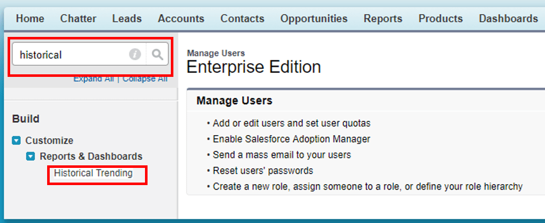
4. Select Opportunity. Check the box marked Enable Historical Trending and Click Save.

You are now good to install the Enterprise version of the GSP Sales Dashboard.
For more instructions on the dashboard installation process, including enabling Historical Trending, play this video.
Step 2: Set the Close Date Change Counters
One of the most powerful features of the GSP Dashboard is the table that tracks the number of Close Date month extensions.
The table shows deals that are due to close this month.

The table presents the Opportunity Name along with three pipeline quality metrics:
- Number of Close Date month extensions (the number of times the Close Date has moved from one month to another)
- Number of days since the last Stage change, and
- The Age of the opportunity.
3 Killer Pipeline Quality Metrics That Highlight When To Be Sceptical gives great advice on how to use this information to get more accurate sales forecasts.
After you have installed the dashboard, the table will track these metrics for all new opportunities created from this point forward.
However, with a few simple steps you can also get the metrics to track existing opportunities.
This short video shows exactly what you need to do.
Additional Resources
12 Must-Have Charts Blog Post
The 12 Must-Have Charts Blog Post is a comprehensive resource that explains how to use each of the dashboard charts to boost pipeline visibility.
The also contains links to additional videos and articles that provide even more details
12 Must-Have Charts eBook
Download our eBook to read about our commentary on each of the charts. Contains examples of how to use each chart for sales performance visibility.
GSP Salesforce Apps
We have a range of apps that extend salesforce functionality in key areas.
These include:
- Target Tracker for measuring sales performance against target.
- Custom Schedules App for forecasting revenue over time, and the
- Product Manager to make it easy to add Products to Opportunities or Quotes.
Salesforce Implementation Services
We have a range of implementation services that can help you maximize your benefits from salesforce.
Simply get in touch to find out how we can help you.
Is Your Salesforce Working as Hard as You Are?
Book a free 45-minute review. Bring your biggest challenge — we'll give you straight-talking, actionable advice, no strings attached.
Free Salesforce Review | 45 Minute Web Meeting | You Set the Agenda