10 Account Planning Best Practice Tips | How To Create Plans That Work
Proven tips and expert insights to help you build strategic account plans that drive real results.
Last updated June 3, 2026


Download the 12 Must-Have Charts for Your Salesforce Dashboard eBook today!
For this article, I harvested the ten most potent account planning best practices from the dozens of companies that use the GSP Account Plan app.
Then I combined the results with my twenty years of experience working with customers to develop Key Account Plans that actually work.
The result is this all-new guide to account planning best practices.
So, if you are looking for tips and advice that will improve strategic account planning in your business, this is the right place to start.
Let’s begin.
What Is Account Planning?
All sales managers focus heavily on opportunity management in the short-term and pipeline coverage in the mid-term.
Nevertheless, if you concentrate only on funnel management, your approach is inevitably tactical and non-strategic.
That’s fine for the customers and prospects that are not vital for significant revenue growth.
However, for the companies that figure in your high to critical importance category, you need a more comprehensive vision and strategy.
Like steering an oil tanker, it’s essential to look well ahead and know which port you are targeting. Leave it too late, and you risk ending up on the rocks.
That’s what we mean by account planning:
Account Planning is the process of defining how to develop and extend your relationship with customers and prospects for mutual benefit over the mid to long term.
You memorialize the output in an Account Plan.
The plan acts as a reference point for carrying out the actions and initiatives you identify and provides a baseline for measuring the impact.
In other words, the plan is a route map for growth. It explains how we will develop the relationship and grow the business with critical customers and prospects
How To Create Account Plans In Salesforce
There is no standard Account Plan tab in Salesforce. Yet this activity is vital for most B2B companies.
That’s why we created the GSP Account Planning app.
Our goal was simple:
Strike the right balance between an Account Plan that is straightforward to complete in Salesforce. It mustn’t become a chore for salespeople. However, provide enough content and functionality for it to be effective.
We believe we got it right:
“This app is extremely easy to use, customizable, and provides outstanding insight into account planning and metrics. Additionally, GSP offers outstanding customer support – Gary and his team are utterly AMAZING.” AppExchange Review, January 2021.
And by the way, we also aimed to make it easy to buy. The price of the app is a straight $450 per month with no user-based fee.
You will find the full details about the app, including screenshots, video, and free trial options on the AppExchange Listing.
With that, here are my best practices based on discussions with our customers and my experience in working with clients.
- Define the Account Plan cadence.
- Use a Four-Step approach to account planning.
- Bring your goals to life with actionable objectives.
- Write your SWOT using a pre-defined sentence structure.
- Build multiple Account Plans for large, complex customers and prospects.
- Create holistic, multi-team plans.
- Raise quality through peer, manager, and customer coach reviews.
- Define (and agree upon) your internal resources.
- Apply the Three Handshakes Rule to stakeholder management.
- Use vital metrics to measure success.
10 Account Planning Best Practices
1. Define the Account Plan cadence
What period should your plan cover? A quarter of a year? A half-year? A full year?
Here’s my best practice rule of thumb:
An Account Plan should cover a period of three to four times your typical opportunity sales cycle.
In other words, if it takes, on average, three months to do a deal, then you should be working with 12-month account plans.
Here’s the reason:
The thinking that goes into your Account Plan is more strategic than that for managing an opportunity. Executing the work takes longer to accomplish than that for a typical sales deal.
On the one hand, if your plan period is too short, you may as well dispense with it and managed individual deals. On the other hand, too long, and it is no longer meaningful.
I’ve found the multiplier of three to four times the sales cycle to be about right and for many companies, that will be twelve months.
Often, you will want to align this cadence with your companies’ financial year for the reasons I outline here.
2. Use a Four-Step approach to account planning
Often, “here’s the template, go and build your account plans” is the straightforward instruction given to salespeople and account managers.
Unfortunately, without guidance and structure, expect a wide variation in the number, quality, and depth of the account plans created.
Instead, here is the four-step best practice approach I’ve found works best:
a) Territory planning. Segment your territory to identify the customers and prospects that need account plans.
You can use the two fields that we include in the GSP app to do this.
The Current Segment describes your current relationship with the Account. The Target Segment reflects how you want to develop that relationship. Define these two values for each Account.
For ALL Strategic Customers, you need an Key Account Plan. This Account Plan will explain how you will maintain the relationship.
For all the other Accounts, build an Account Plan where there is a significant journey. In other words, if you want to transition a business from Steady to Strategic Customer status, you need to explain how you will make that journey.
b) Account Planning. Create the Account Plans for those customers and prospects where you aim to transition the relationship.
c) Objective Planning. Build the objectives that bring the Goals in the Account Plan to life. This article includes specific best practices on Goals and Objectives.
d) Opportunity Co-creation. This step means you must meet and engage with the customer.
In this final step, you talk about the projects the customer is planning over the next twelve months. Jointly identify the opportunities that you will work on together that relate to these projects.
You ask the customer for a commitment, not that you will win the opportunity. Instead, you ask for a promise that you will both invest time and effort exploring whether a deal is achievable.
Finally, create Salesforce opportunities and double-check that the Account Plan aligns with your revenue goals fully.
3. Bring your Goals to life with actionable Objectives
The best goals are challenging and ambitious. (No one gets motivated by mundane goals).
However, it’s best practice to combine vision-setting goals with down-to-earth objectives. Here’s what I mean.
Goals set the direction and are often broad in nature. They explain what we want to achieve, but unfortunately, they are tricky to measure.

As goals are visionary and broad, we don’t have a report or dashboard chart in the GSP Account Plan app that measures them. However, we do, of course, have reports and charts on objectives.

In summary, use goals to set the direction. Define the objectives that will take you on that journey.
4. Use a pre-defined SWOT sentence structure
Don’t be tempted to write notes or even one-word responses within the SWOT.
For example, ‘Price’ or even ‘We charge more than competitors’ can be a strength, weakness, opportunity, or threat. It depends on the context.
Instead, write whole sentences that give the context. You can pre-define this structure.
I recommend starting with the condition within your customer or prospect.
Here’s an example of a threat:
“Acme’s fall in revenue during the pandemic means they are aggressively cost-cutting. As we charge more than competitors, to negate price competition, we need to demonstrate how higher product quality reduces manufacturing faults and lowers total costs.”
And an example of an opportunity:
“Acme is preparing for a significant uplift in the quality of customer service to reduce customer churn. We can demonstrate that our products’ higher quality will reduce manufacturing faults and significantly improve customer service ROI.”
Now that there’s clarity on the SWOT, you can define the specific objectives needed to take advantage of the situation.
5. Build multiple Account Plans for complex customers
Sometimes your customer or prospect is a large organization with many parts. These parts can be geographical areas, individual business units, or even departments within the same company.
Should you create one big Account Plan? Or a different Account Plan for each part?
The best practice is to do two things.
First, create a Strategic Account Plan for each decision-making unit.
If each part of the company is responsible for its own buying decisions or significantly influences HQ buying decisions, it should have a unique Account Plan.
Second, take steps to coordinate and collaborate on the various Account Plans.
For example, if the headquarters make buying decisions on behalf of the overall company, you likely only need one Account Plan. This approach assumes no other parts of the company influence the buying decision (which might be a dangerous assumption).
However, if each country or business unit makes its own buying decisions, you need a Key Account Plan for each.
What’s the best way for many people in your company to collaborate if there are multiple Account Plans? This collaboration is essential if you want to act with a unified voice with the customer.
First, I recommend using Chatter to collaborate on individual Account Plans. All team members follow each plan on Chatter. Doing this means you get automated updates when critical information changes.
Still Doing Account Planning Outside of Salesforce?
Book a free 45-minute demo. Tell us how you currently manage account plans — we'll show you exactly how Account Planner brings everything into Salesforce and helps your team identify and win more upsell and cross-sell opportunities.
Free Account Planner Demo · 45-Minute Video Call · No Sales Pressure
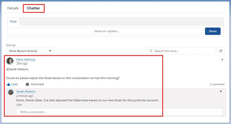

Second, I recommend creating a Chatter Group for each strategic customer or prospect. Use this group to share qualitative information that’s of interest to everyone.
For example, you can share information about the customer’s strategy, business plans, gossip, or rumor at the head office.

By the way, don’t forget that our app gives you a new Account Hierarchy button on the Account page.
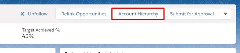
You can use this button to get tremendous visibility of the corporate relationship and contacts in large, complex organizations.

In this blog post, I explain in detail how to achieve all of this in Salesforce:
How To Build Powerful Key Account Plans in Salesforce.
6. Create holistic multi-team plans
Should you have different Key Account Plans for your internal sales, marketing, customer service, and other teams.
My answer is straightforward.
No, you should not. Instead, create a single Account Plan that spans many departments and teams.
Remember, the Account Plan is a strategic document explaining how your company will drive the relationship with another business.
The objectives and activities needed for this may be widespread in your company. However, your customer doesn’t care about your internal boundaries.
What they want is a joined-up service that delivers on your promise. That means you need a single Account Plan on which everyone works together.
Again, you can use Chatter on the Account Plan to keep each other informed with updates. Many of our customers are also using Quip, embedded as a separate tab:

It’s a great way of sharing notes on topics related to the Account Plan.
7. Raise quality through reviews
You can maximize Account Plan quality through peer, manager and customer coach reviews
Two brains are better than one, as they say.
I consistently find that the highest quality Account Plans happen when two or more people work on the content.
Here are three ways you can do that.
- Peer reviews
If you are a sales manager, I recommend you insist that a colleague reviews each Account Plan the sales team creates. The teammate is there to improve and enhance the Account Plan.
They should be asking challenging questions like:
- What additional opportunities can we develop?
- Who else, apart from the people you have listed, will influence our success?
- What other things need to happen to achieve the goals?
- What could go wrong, and what can we do about it?
I also recommend you draw from examples of other Account Plans within the team. Fine-tune and iterate until you have a strategy with which both team members are happy.
- Manager reviews
In most businesses, the manager will naturally want to review the Account Plan. Optionally, you can also wrap an Approval Process around this process.

Either way, it’s a similar process of collaborating and working together to produce a high-quality document that you are confident is deliverable.
- Customer reviews
Yes, you read that right.
The best Account Plans contain opportunities co-created with the customer. I wrote about this earlier in this article.
It gets even better if you have a coach. A coach is an employee at your customer or prospect that, “wants to see you win, because when you win, they win.“
The right coach will guide, direct and counsel you. They will point out obstacles in advance and help you figure out how best to present your case.
It’s not easy to find the right person or build this super-powerful relationship. But if you have a coach, your Account Plan is vastly improved if they are involved.
8. Define and agree upon internal resources
More often than not, you can’t deliver an Account Plan entirely on your own.
Frequently there’s a team involved, even if it’s only behind the scenes. For strategic customers, it’s sometimes more like a small army.
Even in small companies, you’re likely to need other resources in delivering a plan that works.
Nevertheless, this area is commonly weak in many Account Plans.
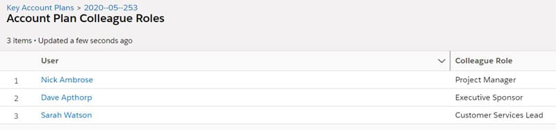
Internal resources, of course, come in many shapes and sizes. It’s not just people – pre-sales engineers, project managers, customer service leads, and senior managers.
You may also need access to special pricing, vital equipment or facilities, marketing programs, and content.
I’m sure you can refine the list based on the knowledge of your company and customers.
Therefore, it’s essential to define AND agree upon the resources you are going to need. That’s especially true when there is competition from other salespeople and day-to-day operations for those same resources.
Make sure these resources and the commitment are explicit. And of course, use the Account Plan Colleague Role section of the GSP app to list the critical teammates upon whom you rely.
9. Apply the Three Handshakes Rule to stakeholders
We all know you need to manage your stakeholders for success with your Account Plan.
Yet too often, we limit our stakeholder thinking. We may even only include people we know or have met in the Account Plan.
Unfortunately, decisions within your customer or prospect are likely to involve many more people. That means you need to cast your stakeholder net more expansively.
Here’s a critical account planning best practice, that I call the Three Handshakes Rule.
The Rule says you must shake the person’s hand within three degrees of separation from the person you know.
(Admittedly, I thought of the Three Handshake Rule name before I’d heard of Covid-19, and we all began touching elbows. But you get the idea).

For example, you know John. He’s your primary contact at Acme. The Rule says not only must you shake hands with John’s boss, but also John’s boss’s boss.
However, it doesn’t stop there. The example above uses the Rule vertically. Can you also apply the Three Handshake Rule laterally?
Of course, you can, and you must.
Who is the person that influences John, other than his line manager? Whoever it is, the Rule says you need to shake her hand. And the hand of the person that influences her.
Naturally, I’m assuming a mere handshake is not sufficient. However, you get the idea. You’ll engage in dialogue with each person whose hand you shake.
Use the Account Plan to identify these vital relationships and your strategy for reaching these interconnected people.
10. Use vital metrics to measure Account Plan success
An Account Plan is only worth its salt if you can measure success.
Within the GSP Account Planning app, there are two ways to track the success of your plan.
The first is to monitor the outcome of the Objectives. There’s a report and dashboard chart within the app for this.
The second method is to measure the value of opportunities linked to the Account Plan.
As a variation to this, you might want to track the scheduled revenue that lands during the lifetime of the Account Plan. That’s instead of the total opportunity amount.
Both are possible with the GSP Account Planning app.
In this example, we can see the opportunities linking to the Account Plan.
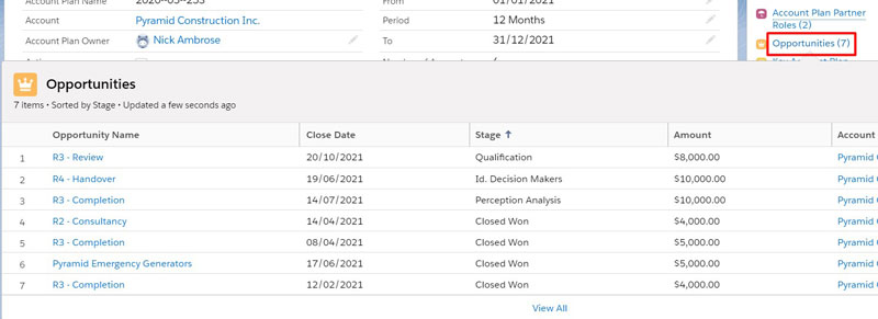
The opportunities are associated with the Account Plan because they have a Close Date within the lifetime of the Account Plan.
The value of these opportunities rolls up automatically to the KPI section.
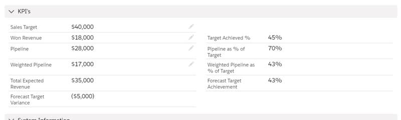
We can see in this case there is $18,000 of opportunities already won. There is $28,000 of open or pipeline deals. The weighted value of these pipeline opportunities is $17,000.
That means our Expected Revenue is $35,000; that’s the sum of the won deals plus the weighted pipeline.
Consequently, in this example, we are forecasting a small shortfall. However, knowing this information means we can plan steps to correct the negative shortfall.
You can take the same approach if scheduled revenue is the critical revenue metric in your business.
For example, you can use the GSP Revenue Schedule app to track won and pipeline opportunity income over time.
What To Do Next
If the best practices in this blog post sound like the sort of things you should be doing in your business, here are three things you can do next.
- Take a free trial of the GSP Account Planning app. Do this by clicking the Get It Now button on the AppExchange listing. You can choose to install the app in your production or sandbox Salesforce environment. There’s straightforward instructions for setting up in the app in the Quick Start section of our Knowledge Base.
- Request a free consultation. A colleague or I will facilitate a one-hour web meeting to help set up and drive Account Planning in your business.
You may also want to use this session to talk about any changes or customizations that will fine-tune the GSP to your specific business.
- Try the GSP Revenue Schedule app. This app is tailor-made for companies that need to schedule revenue over time in Salesforce. Visit the AppExchange Listing for full details, including screenshots, videos, and a free trial.
Speak soon!
Account Planning in PowerPoint Won't Grow Your Key Accounts.
See how Account Planner brings structure and visibility into Salesforce — helping your team turn objectives into cross-sell and upsell revenue.
Account Planner Walkthrough · 45-Minute Video Call · Free Trial Available