Pipeline Visibility
How to Stop Waterlogging Affecting Your Sales Pipeline Accuracy
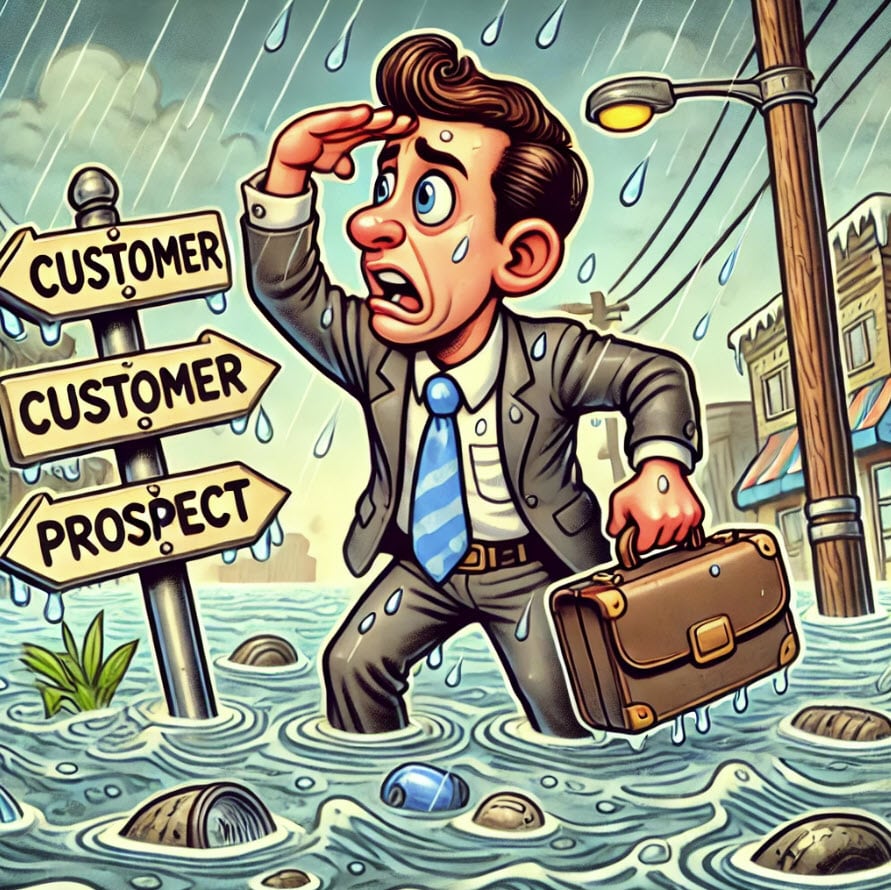
How to Stop Waterlogging Affecting Your Sales Pipeline Accuracy The hidden threat to accurate sales forecasting. Last updated March 19, 2026 Written by Gary Smith, CEO Related Blog Posts How to Stop Waterlogging Affecting Your Sales Pipeline Accuracy The Best Way to Track Sales Targets in Salesforce The Myth About 3x Pipeline Coverage—and What to…
Read MoreThe Best Way to Track Sales Targets in Salesforce

The Best Way to Track Sales Targets in Salesforce Discover How GSP Target Tracker Brings Visibility and Control to Quota Tracking and Sales Target Reports in Salesforce. Last updated March 18, 2026 Written by Gary Smith, CEO Related Blog Posts How to Stop Waterlogging Affecting Your Sales Pipeline Accuracy The Best Way to Track Sales…
Read MoreThe Myth About 3x Pipeline Coverage—and What to Do Instead

The Myth About 3x Pipeline Coverage—and What to Do Instead The 3x Pipeline Coverage Rule is Flawed. This is How High-Performing Teams do it Differently to Secure Strong Funnel Coverage. Last updated March 13, 2026 Written by Gary Smith, CEO Related Blog Posts How to Stop Waterlogging Affecting Your Sales Pipeline Accuracy The Best Way…
Read MoreMaster Your Pipeline Coverage with the Sales Manager Dashboard

Master Your Pipeline Coverage with the Sales Manager Dashboard The pipeline coverage and sales performance visibility managers need to stay ahead Last updated February 19, 2026 Written by Gary Smith, CEO Related Blog Posts How to Stop Waterlogging Affecting Your Sales Pipeline Accuracy The Best Way to Track Sales Targets in Salesforce The Myth About…
Read More12 Must-Have Salesforce Dashboard Charts | With Video And Examples

12 Must-Have Salesforce Dashboard Charts | With Video And Examples How to make your dashboards drive smarter sales conversions. Last updated March 13, 2026 Written by Gary Smith, CEO Related Blog Posts The Best Way to Track Sales Targets in Salesforce 12 Must-Have Salesforce Dashboard Charts | With Video And Examples 10 Powerful Sales Performance…
Read MoreYour Complete Guide to Opportunity Stages in Salesforce

Your Complete Guide to Opportunity Stages in Salesforce Opportunity Stages Explained With Best Practice Recommendations. Last updated March 22, 2026 Written by Gary Smith, CEO Related Blog Posts How to Stop Waterlogging Affecting Your Sales Pipeline Accuracy The Best Way to Track Sales Targets in Salesforce The Myth About 3x Pipeline Coverage—and What to Do…
Read MoreHow To Track Whether Your Funnel Is Growing Or Shrinking

How To Track Whether Your Funnel Is Growing Or Shrinking How to keep your pipeline moving in the right direction with smarter Salesforce dashboards. Last updated March 13, 2026 Written by Gary Smith, CEO Related Blog Posts How to Stop Waterlogging Affecting Your Sales Pipeline Accuracy The Best Way to Track Sales Targets in Salesforce…
Read More3 Pipeline Quality Metrics in Salesforce That Point Towards Unreliable Revenue Forecasts

3 Pipeline Quality Metrics in Salesforce That Point Towards Unreliable Revenue Forecasts And How to Boost Your Forecast accuracy with Better Pipeline Scrutiny Last updated March 19, 2026 Written by Gary Smith, CEO Related Blog Posts How to Stop Waterlogging Affecting Your Sales Pipeline Accuracy The Best Way to Track Sales Targets in Salesforce The…
Read MoreThe #1 Salesforce Pipeline Report to Use This Year

Effective sales manage relies on robust visibility of the sales pipeline. This salesforce dashboard chart shows the open opportunities by close date and stage. It gives sales executives the essential information they need to manage the sales pipeline effectively. It allows them to forecast accurately. It enables dud deals to be identified. And it prevents that all too common problem of the over-inflated sales pipeline.
Read MoreTo Exceed Year-End Quota, Apply These Q4 Sales Strategies Now

To Exceed Year-End Quota, Apply These Q4 Sales Strategies Now Contact Us It’s the time of year when sales teams worldwide are under pressure to get deals closed in Quarter 4 and meet year-end quotas. I have worked with many companies under their quarter and year-end pressure. Here’s what I’ve found: Successful teams apply five…
Read More5 Easy Tips That Will Make Opportunity Probability Your Trusted Friend

5 Easy Tips That Will Make Opportunity Probability Your Trusted Friend It’s time to stop ignoring Opportunity Probability – here’s how to make it work with you, and not against you. Last updated March 13, 2026 Written by Gary Smith, CEO Related Blog Posts How to Stop Waterlogging Affecting Your Sales Pipeline Accuracy The Best…
Read More3 Proven Ways To Boost Pipeline Quality You Can Start Today

3 Proven Ways To Boost Pipeline Quality You Can Start Today Tackle the ongoing challenge of pipeline quality with proven Salesforce strategies and practical, free tools. Last updated March 13, 2026 Written by Gary Smith, CEO Related Blog Posts How to Stop Waterlogging Affecting Your Sales Pipeline Accuracy The Best Way to Track Sales Targets…
Read MoreMeasure Sales Pipeline Size With These 4 Vital Dashboard Charts

Measure Sales Pipeline Size With These 4 Vital Dashboard Charts How to get the full picture of your sales funnel with precise pipeline size tracking. Last updated March 13, 2026 Written by Gary Smith, CEO Related Blog Posts How to Stop Waterlogging Affecting Your Sales Pipeline Accuracy The Best Way to Track Sales Targets in…
Read MoreClose Dates In The Past Wreck Pipeline Reports | 5 Ways To Stop It From Happening

Close Dates In The Past Wreck Pipeline Reports | 5 Ways To Stop It From Happening How to transform messy charts into meaningful insights. Last updated March 13, 2026 Written by Gary Smith, CEO Related Blog Posts Spend More Time Selling with Salesforce Apps The Low-Risk and Low-Cost CPQ Alternatives in Salesforce With This App…
Read MoreGetting Started With The GSP Sales Dashboard
Getting Started With The GSP Sales Dashboard A quick-start guide to hit the ground running with better instant pipeline and sales performance visibility. Last updated March 13, 2026 Written by Gary Smith, CEO Related Blog Posts The Best Way to Track Sales Targets in Salesforce 12 Must-Have Salesforce Dashboard Charts | With Video And Examples…
Read MoreHow To Plug A Leaking Sales Funnel In The Right Place

How To Plug A Leaking Sales Funnel In The Right Place Not all leakage is bad – it’s where, why, and what you’re doing about it that matters. Last updated March 13, 2026 Written by Gary Smith, CEO Related Blog Posts How to Stop Waterlogging Affecting Your Sales Pipeline Accuracy The Best Way to Track…
Read More3 Ways to Spot Deals That Will Deflate Your Monthly Sales Forecast

3 Ways to Spot Deals That Will Deflate Your Monthly Sales Forecast Contact Us If your monthly sales forecast has ever fallen through the floor at the last minute then this blog post is for you. Use these three sales metrics to identify the deals that might deflate your monthly sales forecast. Take action on…
Read More5 killer examples of recurring revenue forecasts in salesforce

5 killer examples of recurring revenue forecasts in salesforce Recurring revenue in Salesforce doesn’t have to be messy – here’s how to do it right. Last updated February 19, 2026 Written by Gary Smith, CEO Related Blog Posts How to Stop Waterlogging Affecting Your Sales Pipeline Accuracy The Best Way to Track Sales Targets in…
Read MoreHow to Stop Sandbagging Leading to Inaccurate Sales Forecasting

How to Stop Sandbagging Leading to Inaccurate Sales Forecasting Stop getting surprised by deals that close unexpectedly late in the day Last updated March 19, 2026 Written by Gary Smith, CEO Related Blog Posts How to Stop Waterlogging Affecting Your Sales Pipeline Accuracy The Best Way to Track Sales Targets in Salesforce The Myth About…
Read MoreHow to Spot Poor Quality Deals Using Salesforce Dashboards

How to Spot Poor Quality Deals Using Salesforce Dashboards Contact Us Every Sales Manager is interested in what has been sold. Well, sort of. But what really gets them going is thinking about what will be sold. It’s the size of the sales funnel that drives emotion, energy and attention. So it’s a crying shame…
Read MoreHow to Count the Number of Opportunity Close Date Changes

How to Count the Number of Opportunity Close Date Changes The smart way to identify stuck deals fast and keep your pipeline healthy. Last updated February 19, 2026 Written by Gary Smith, CEO Related Blog Posts How to Stop Waterlogging Affecting Your Sales Pipeline Accuracy The Best Way to Track Sales Targets in Salesforce The…
Read More3 Charts to Help You Measure Sales Pipeline Quality
3 Charts to Help You Measure Sales Pipeline Quality Contact Us In most sales teams there’s a strong focus on the size of the sales pipeline. But size isn’t everything. We want to know that the pipeline isn’t being artificially inflated just to keep the management team at bay. In other words we need to…
Read More